Mehhanism by Maria Muuk, 2014 — Digitized from Tänapäeva kiri (1956) by Villu
Toots. Represents the 1960s mechanical aesthetic.
O Fortuna by Anastassia Tšepaikina, 2017 — A serif font inspired by
19th-century fonts. Made during typography class from a few existing letters.
Sigella by Andree Paat, 2014 — A revival of an unknown typeface discovered on
an early 20th century floor polish tin.
KalliGro Kalli by Aimur Takk, 2016 — A font family where both the grotesque
and calligraphic incision are built onto the same frame.
Rein Grotesk by Georg Ander Sild, 2022 — Inspired by my grandfather. The
letters are built quite flimsy and lofty… just like Rein himself.
Chaos by Sigrid Liira, 2018 — Relationship between
humans and technology and everything in between.
ERKI 30 by Aimur Takk, 2017 — Made for the 30th anniversary of the ERKI
Moeshow. Inspired by 1970-80s ERKIDISAIN student type designs.
Rammus by Ellen Loitmaa, 2020 — A font inspired by the youth culture of the
'60s and '70s.
Kevad by Karl Kevad, 2020 — A simplistic font where the digital nature of
numbers clashes with the old school typewriter.
Ketchup Addict by Birgita Siim, 2019 — Reflects emptiness in stomach and soul
of a Ketchup Addict, who is constantly dreaming of ketchup.
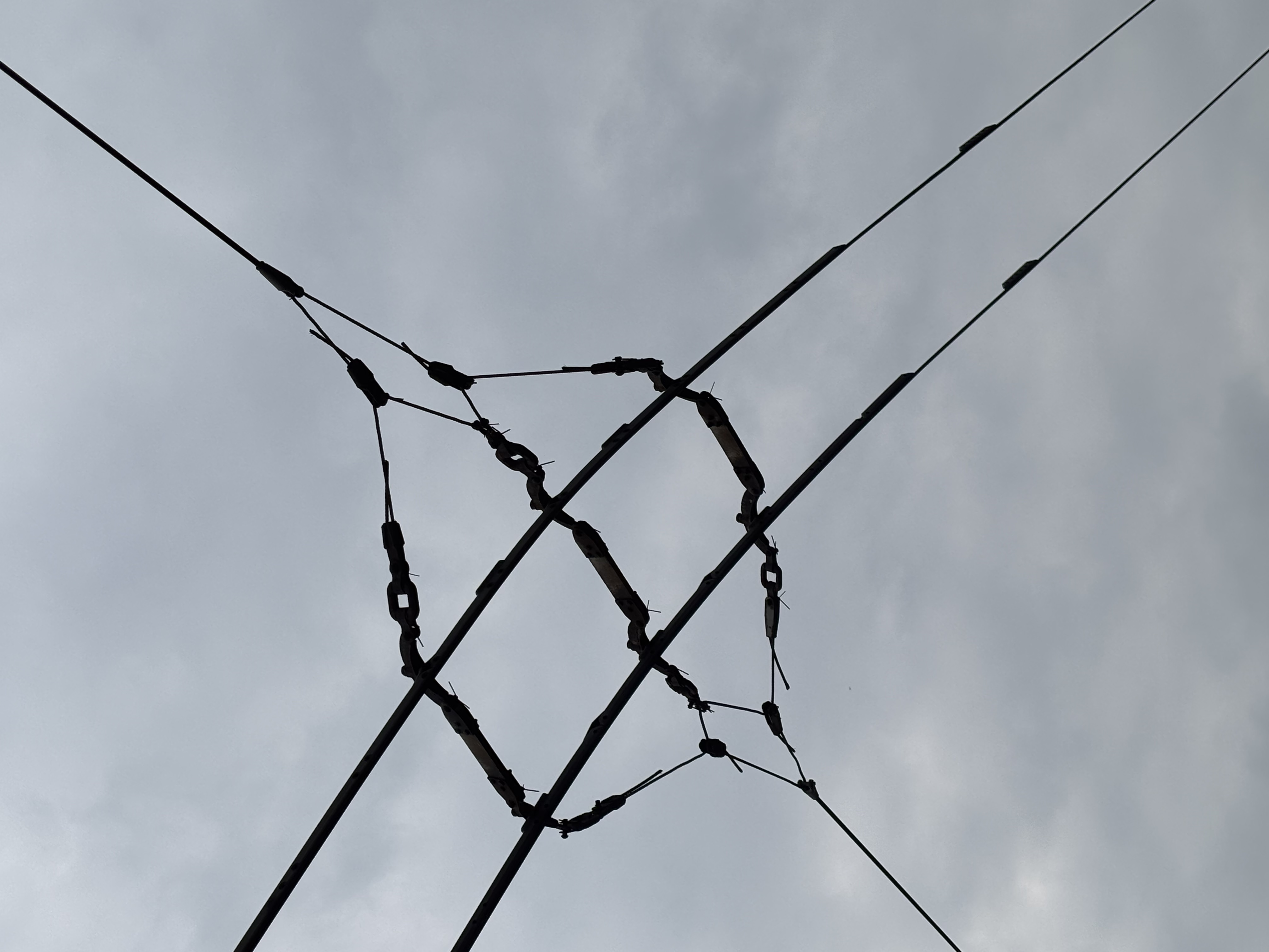
Lambiseim by Kenneth Allik, 2018 — A topic close to my heart is lighting. It
plays a big role in my life. Without lighting I wouldn't see what I am doing.
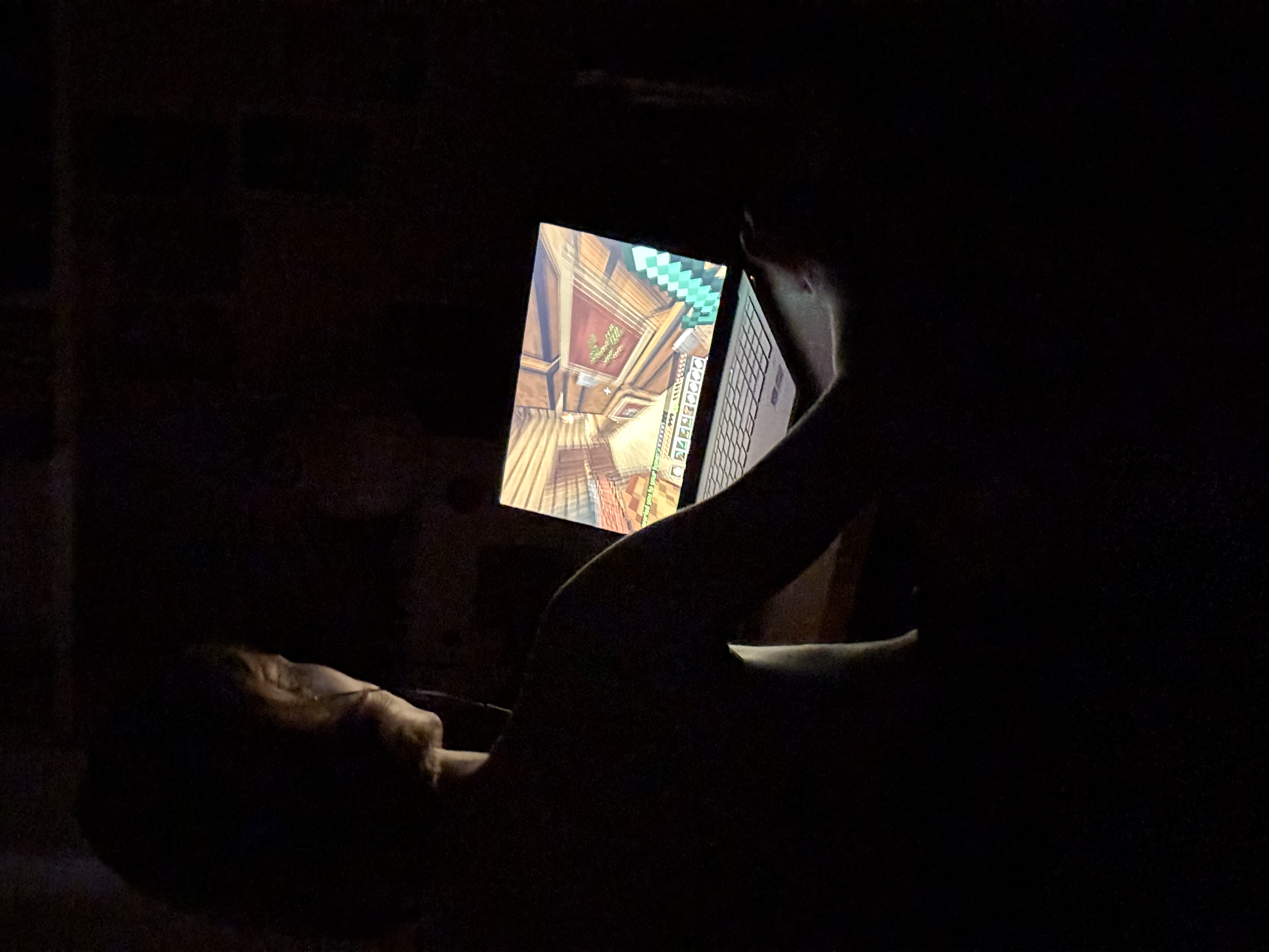
Dap by Moonika Maidre, 2014 — Created in a Dinamo
workshop with Johannes Breyer and Fabian Harb.
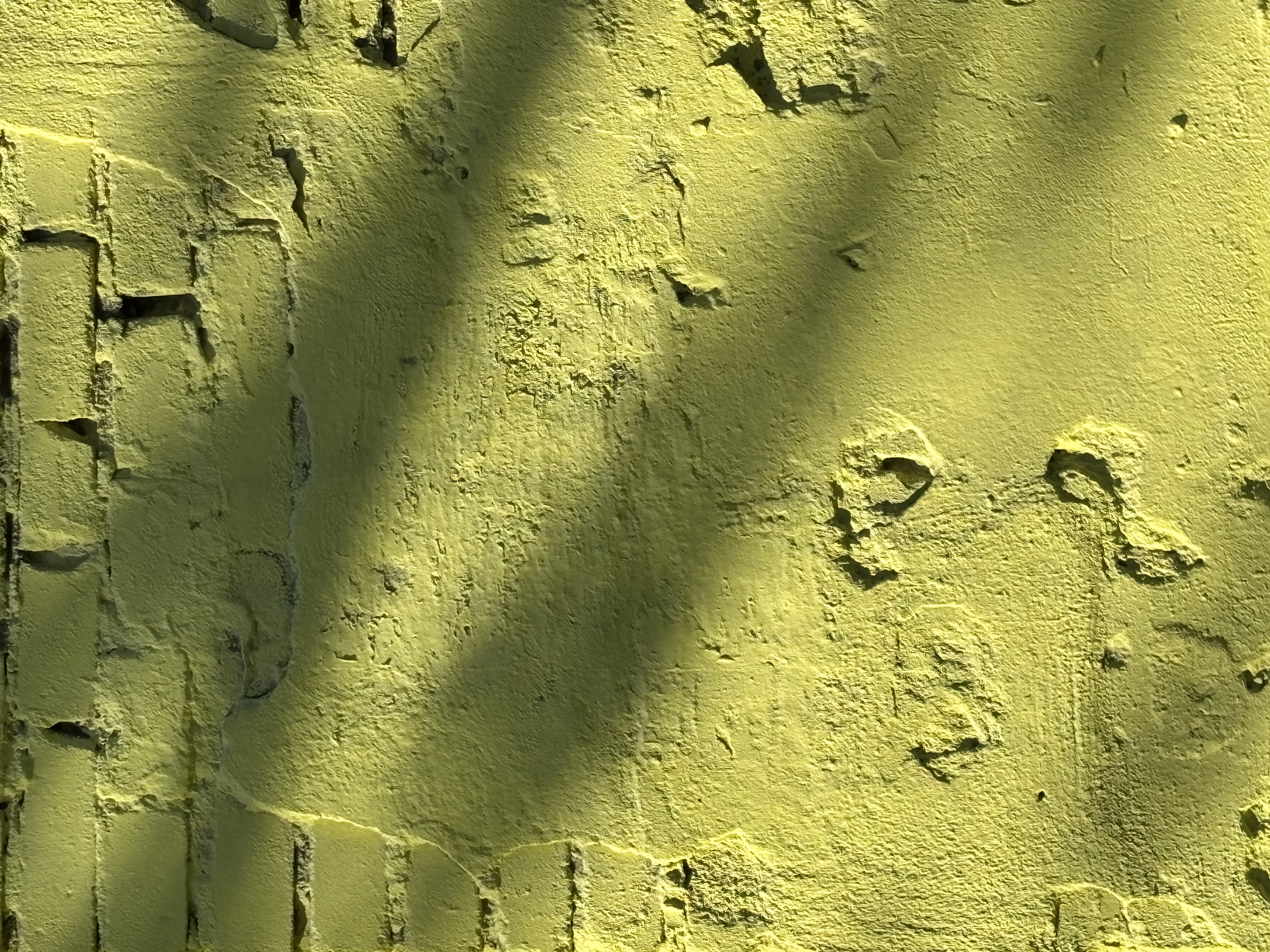
Vaksal by Marje Kask, 2020 — Digitalisation of Estonian train station signs'
typeface. Supports both Latin (extended) and Cyrillic.
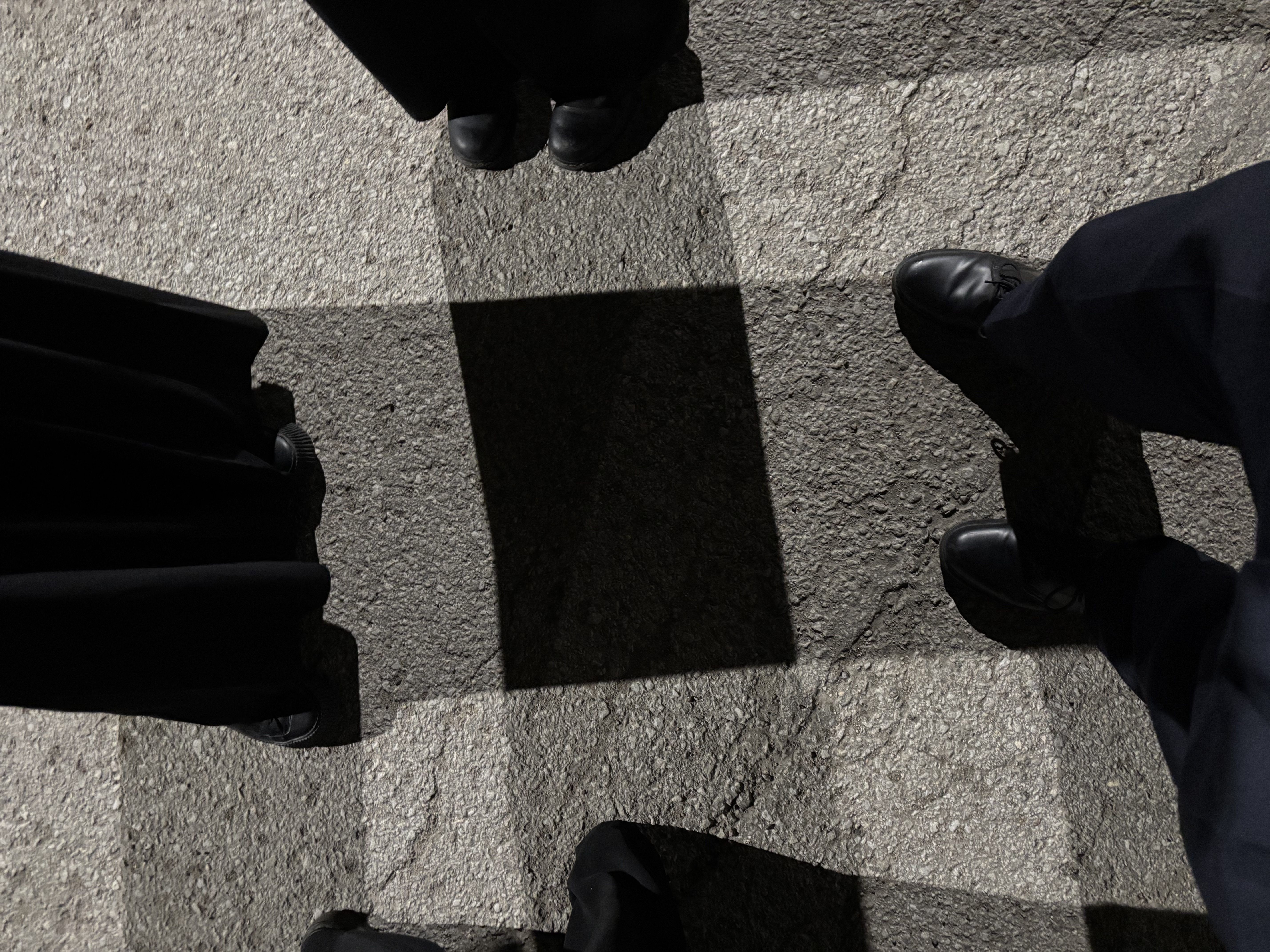
Villowplex by TSG students, 2023 — Collaborative font made using stencils of
existing fonts. A combustion of 3 different fonts by 3 groups.
Tortura by Anna Legrand, 2020 — The font is inspired by reparation after
destruction.
Ornamental by Polina Zahharenkova, 2020 — Inspired by Victorian style
ornaments and nature patterns, conveying their elegance and accuracy.
Esimene by Andree Paat, 2014 — Based on 5 randomly found objects reduced to a
simple circle and line. The first typeface by Andree Paat.
Hellplague by Ilja Moltšanov, 2020 — Initially
'harmless' — in the process of creation, the font acquired satanic attributes in the form of
devilish tails and ears.
Imogen by Aleksander Alev, 2020 — Inspired by Master P's 1998 Album MP Da
Last Don. Classy and boujee.
Lopsakas by Kelli Kütt, 2025 — Bold expressive handmade typeface inspired by
natural forms. Its name translates to 'lush' in English.
Naps by Maria Muuk, 2015 — Created during the workshop Bars and Restaurants.
Inspired by a script on the wall of a postmodern flower shop by Vilen Künnapu.
Pakkonen by Mathias Väärsi, 2017 — A second year project with bold,
considered letterforms.
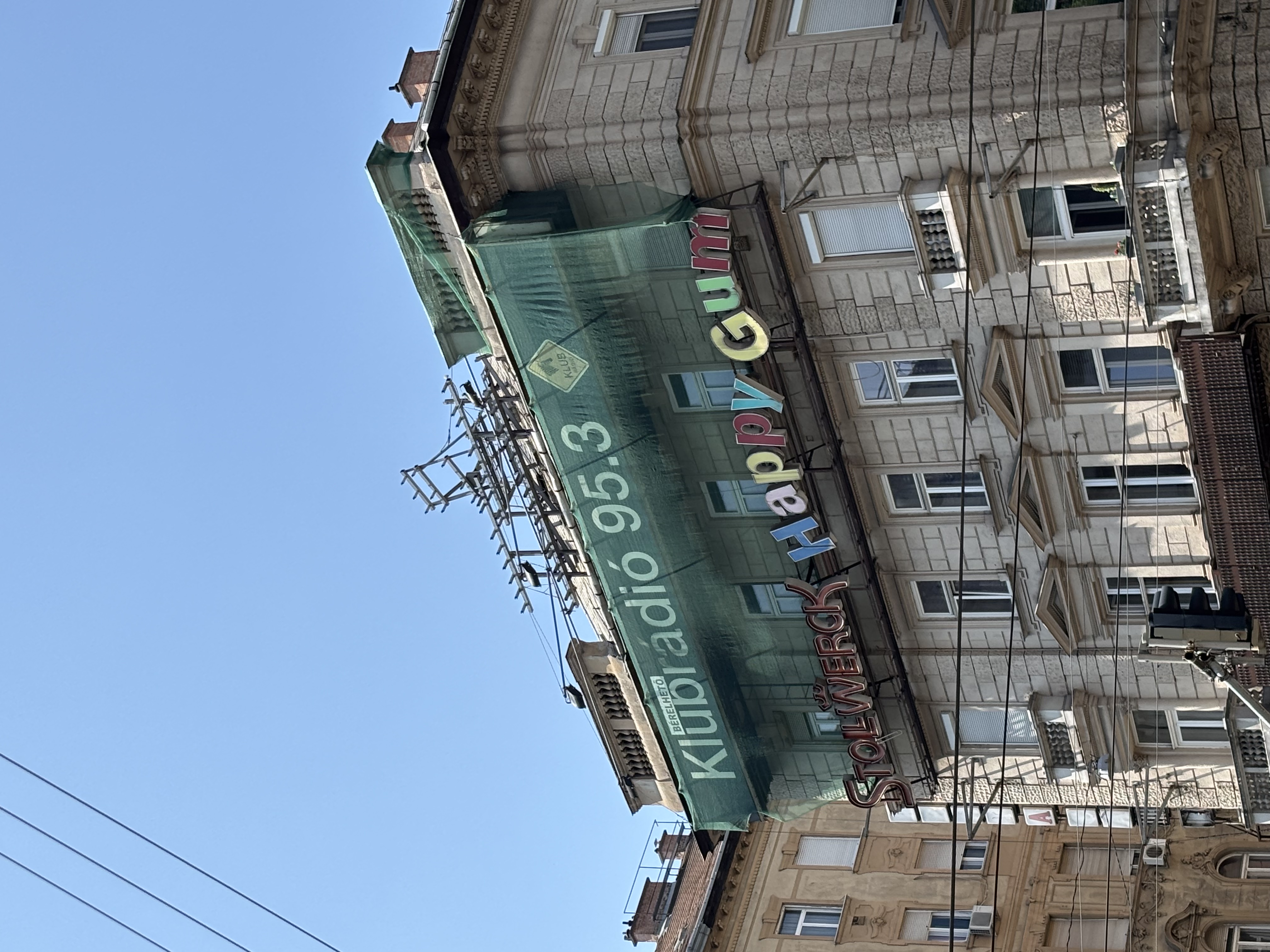
Võrsik by Karri Kaljend, 2015 — A typeface expressing speed and movement.
Stereo Sans by Joonas Timmi, 2017 — A stereometric
font that appears illegible at first glance. The decoding key lies in projecting letter-forming
lines onto one plane.
New Poetic by Jekaterina Kožemjatšenko, 2020 — Inspired by warm summer
evenings, calm sea and inner peace.
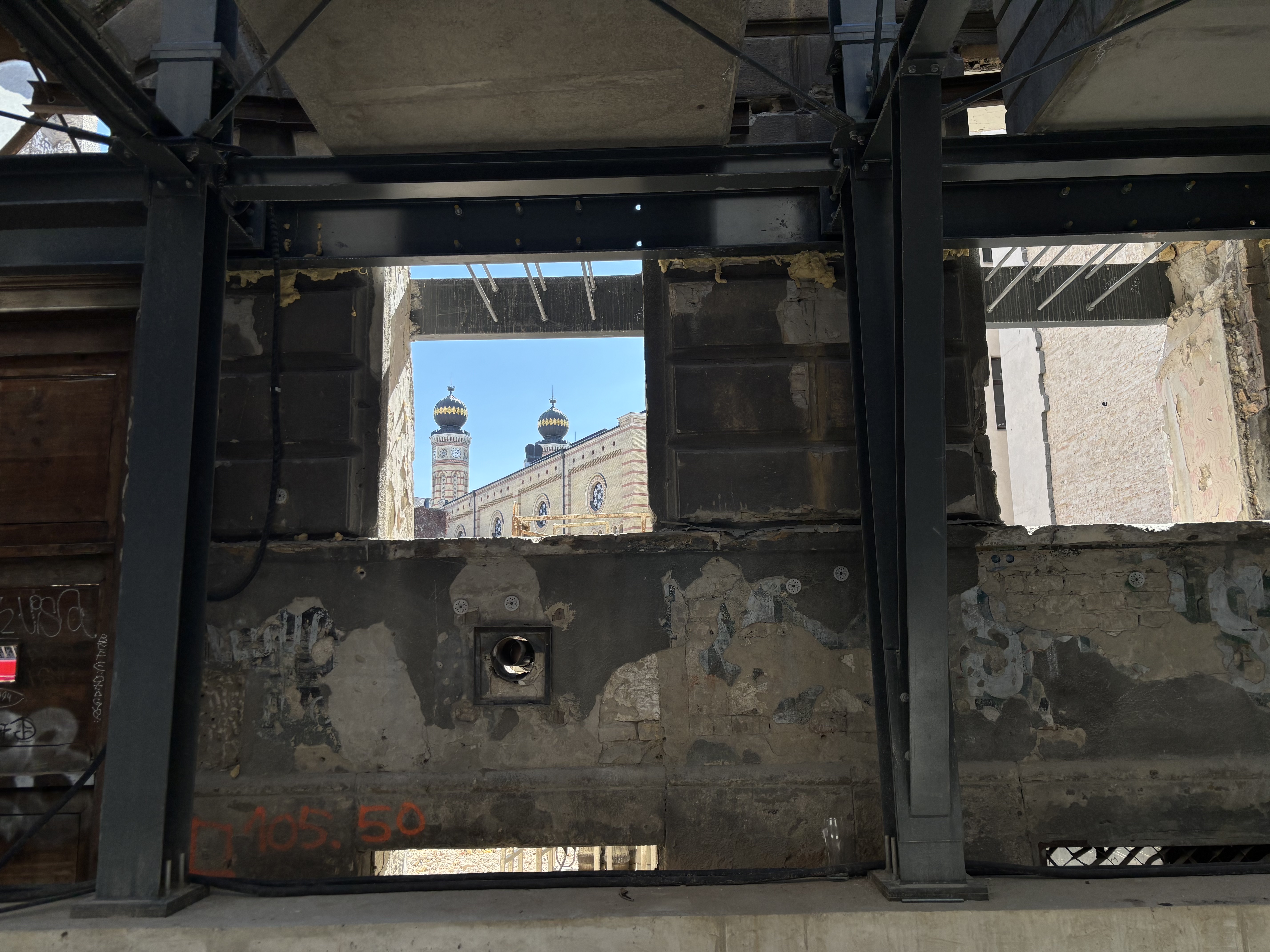
Flowstate by Kertu Kibal, 2020 — Named after the mental state of full
immersion — energized focus, full involvement, and enjoyment.
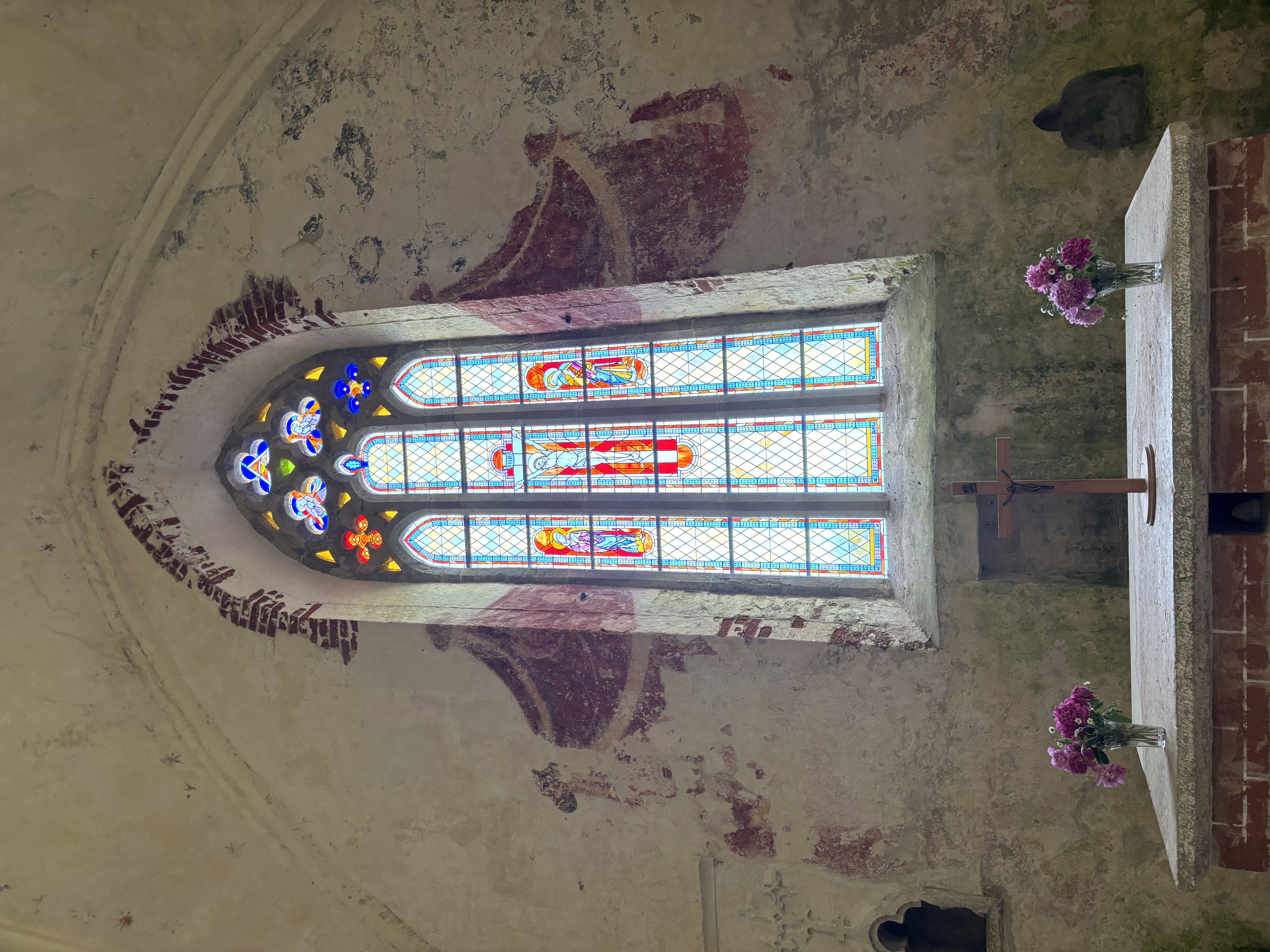
KalliGro Gro by Aimur Takk, 2016 — The grotesque companion to KalliGro Kalli.
Same frame, different calligraphic incision.
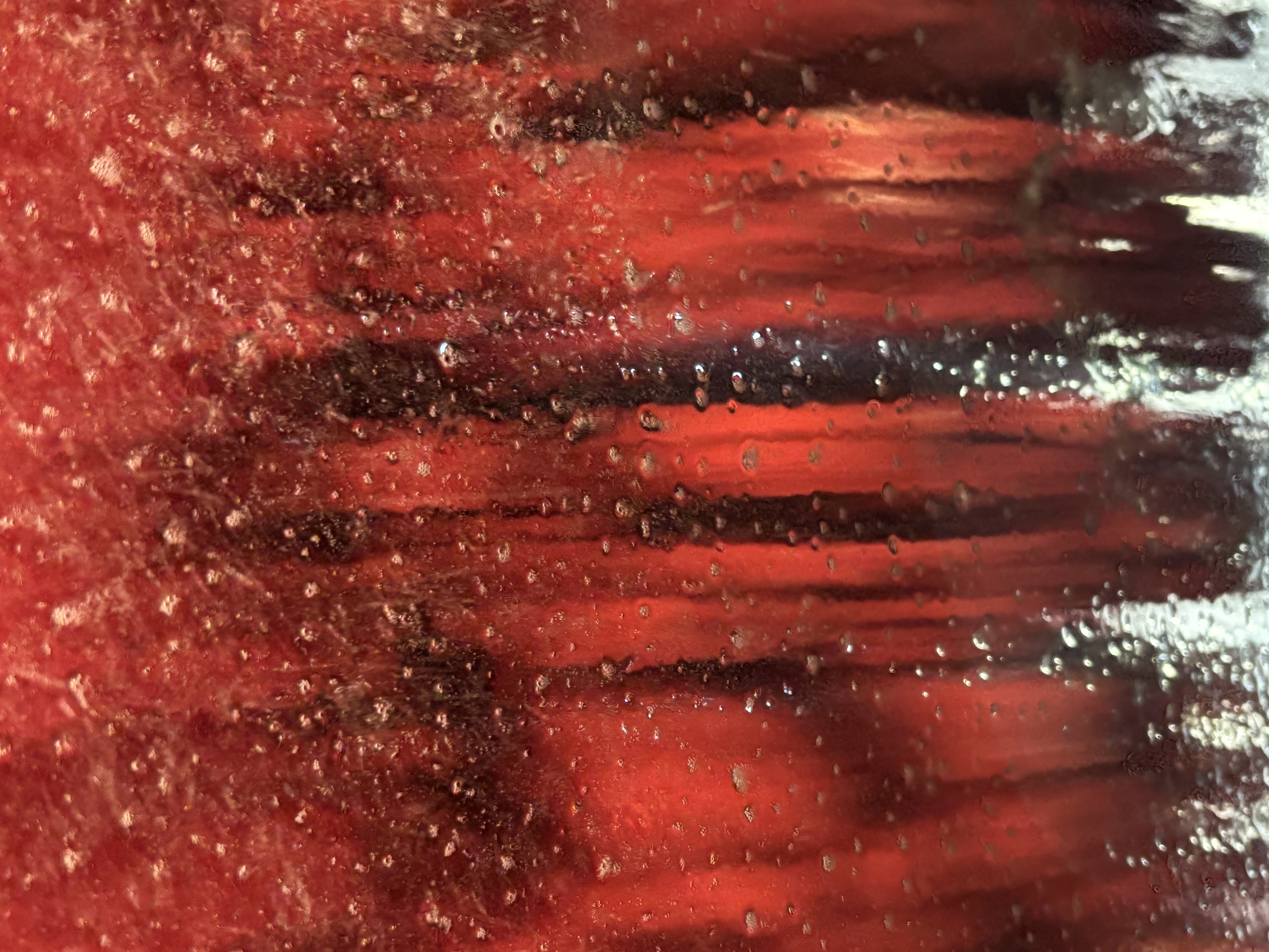
Owl Cave by Villem Sarapuu, 2018 — A typeface inspired by a symbol occurring
in the iconic TV-series Twin Peaks.
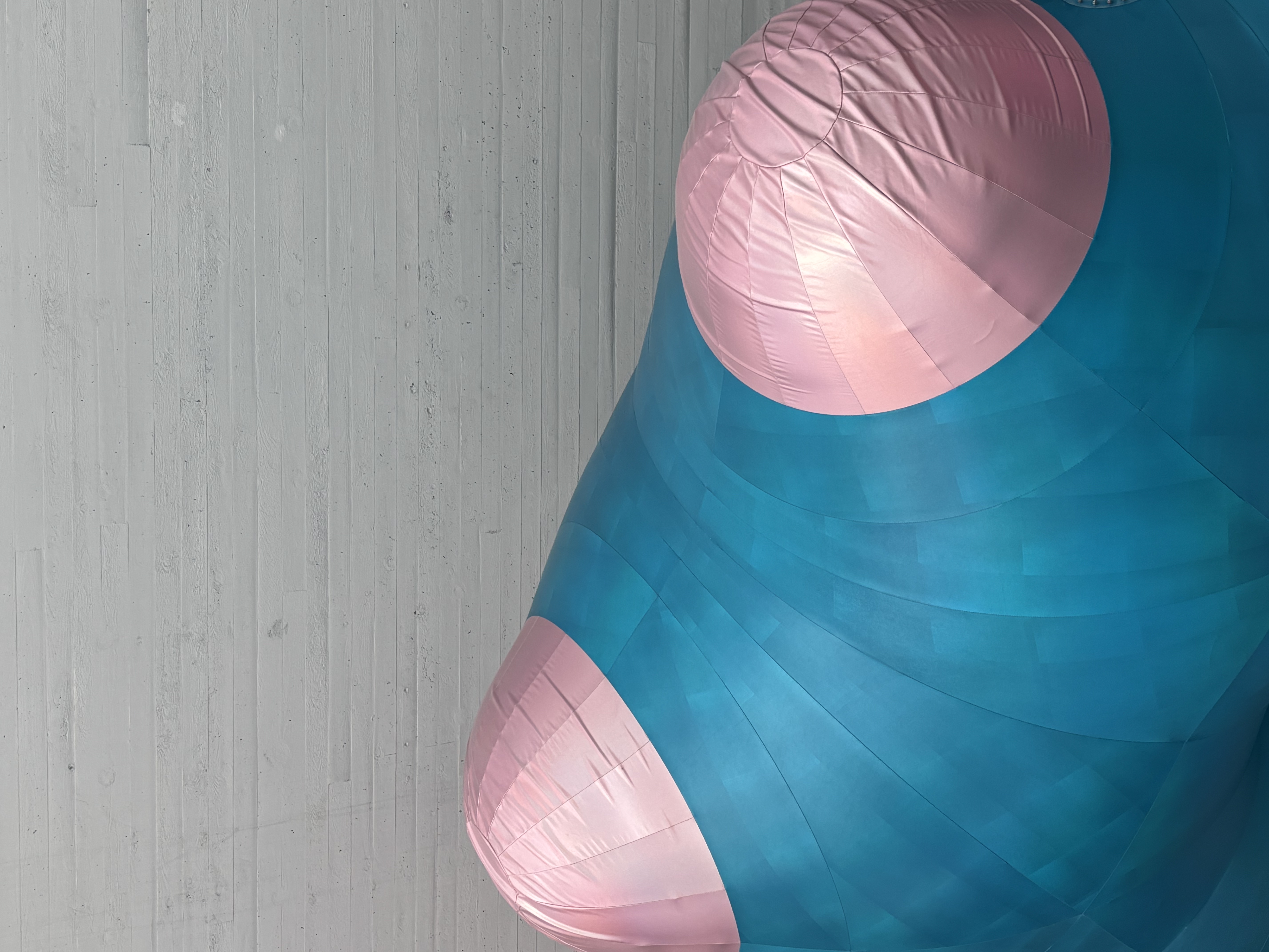
The Times Apex by Urmet Piiling, 2020 — Sharing structural similarities with
Times New Roman, it aims to be the next defining font in the space-time continuum of Typography.
Double Bubble by Aaro Veiderpass, 2019 — A variable
typeface inspired by a sticky situation.
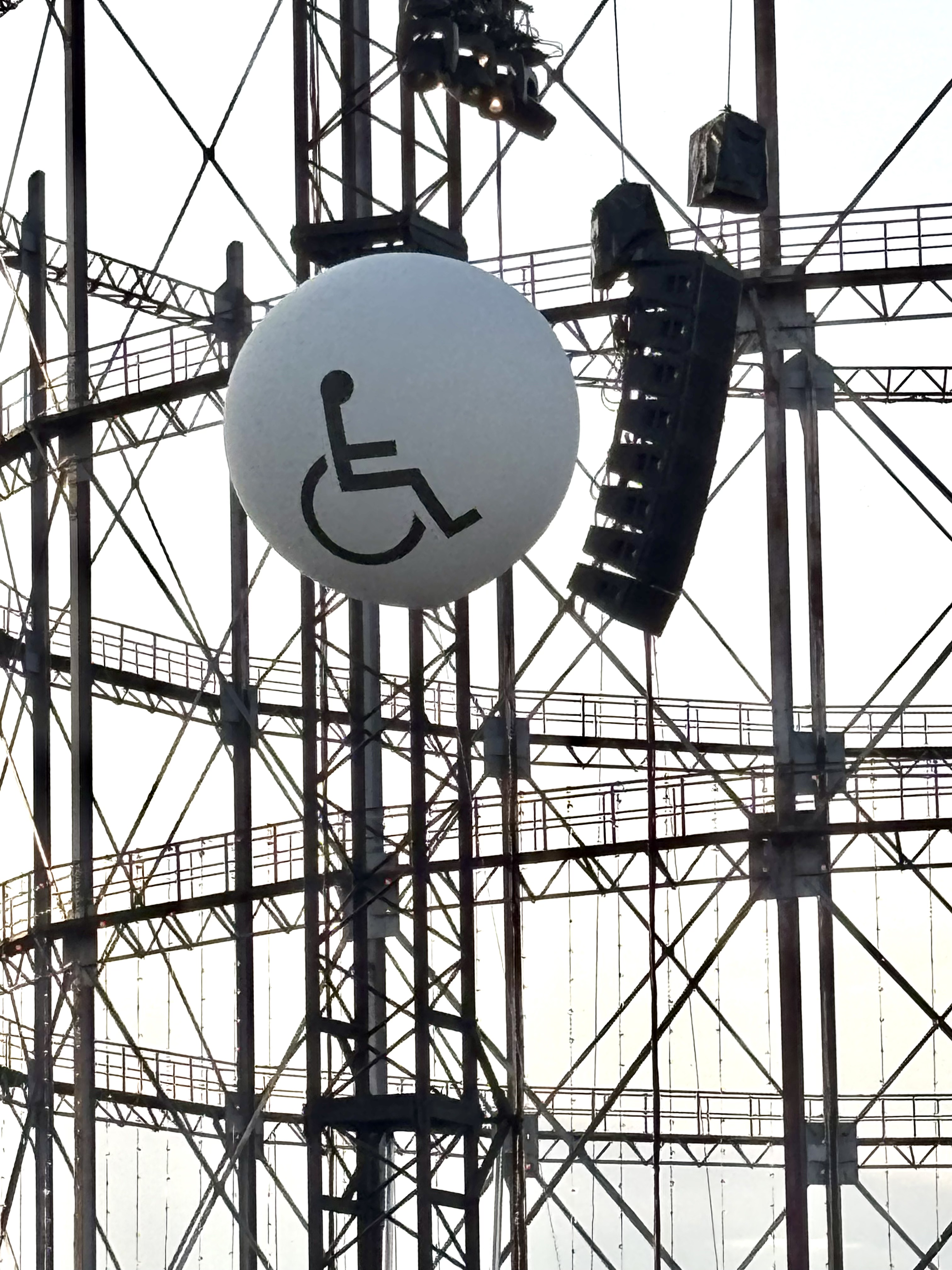
Mozzarella by Stenly Poks, 2018 — A hommage to the genius who invented
cheese.
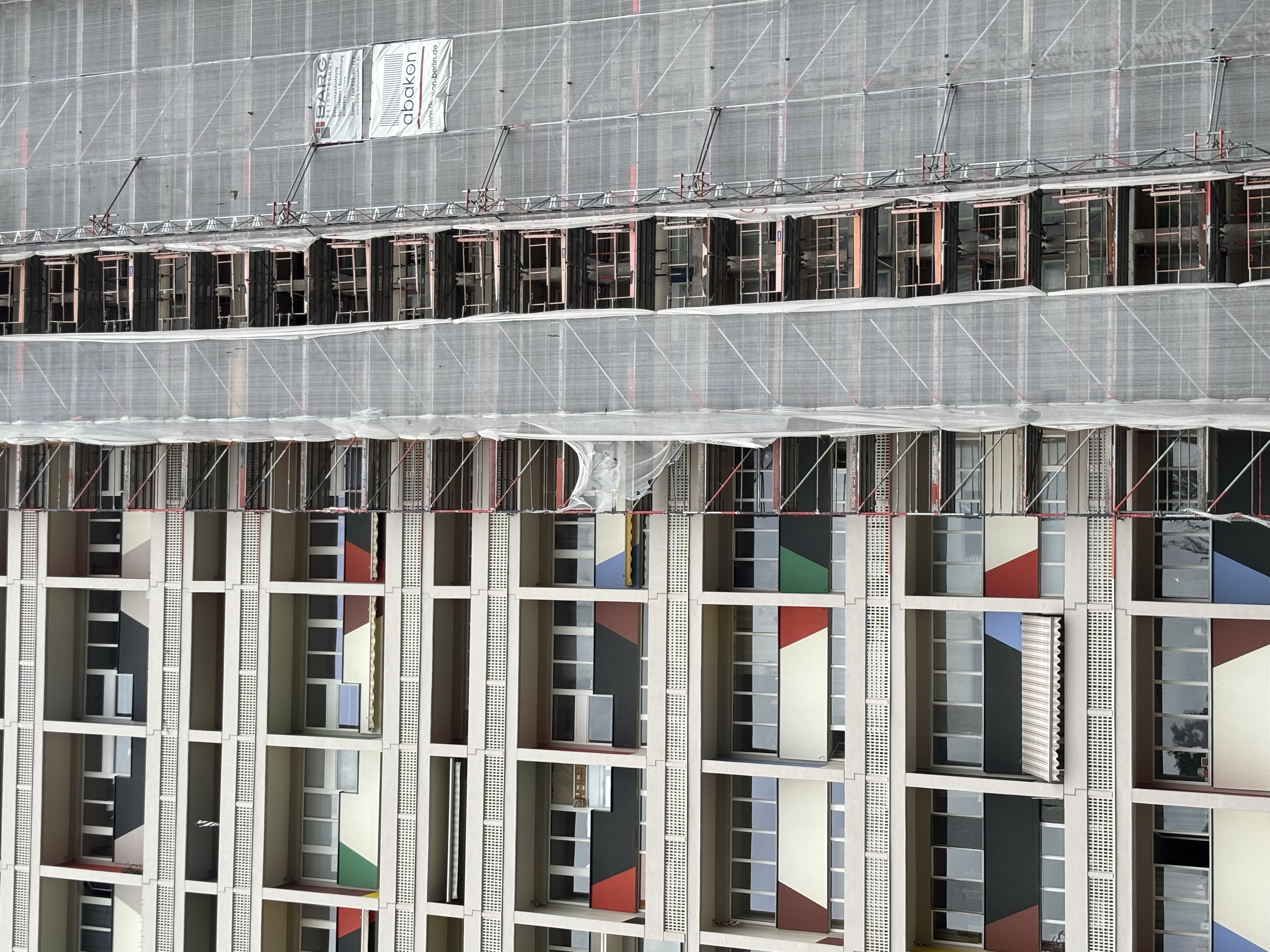
Napulo by Kersti Heile, 2018 — Napulo font is inspired by zodiac signs.
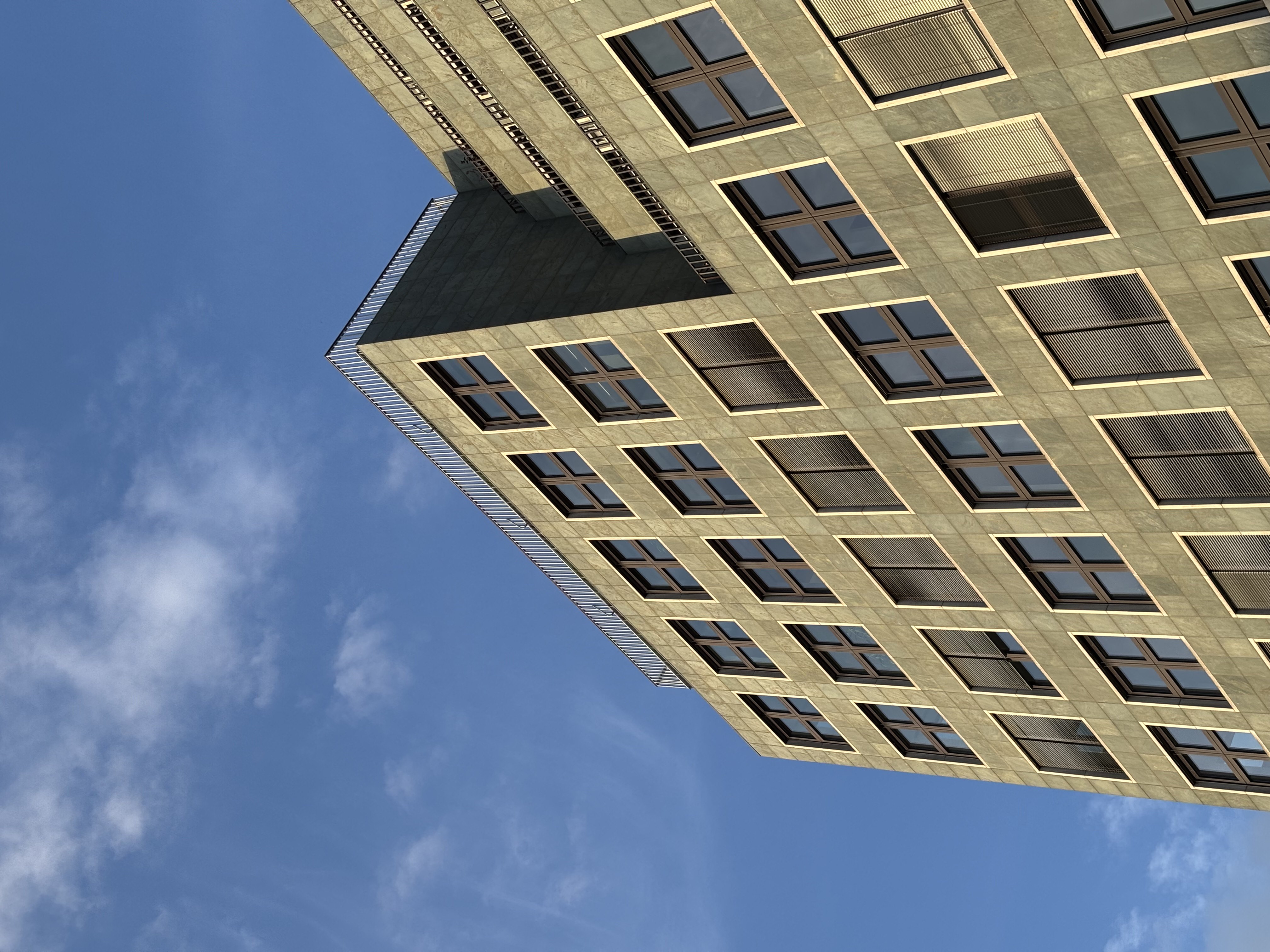
Coffee Time by Maria Muuk, 2014 — Based on randomly found objects — a plate,
plastic spoon, a piece of Sacher cake and a disposable cup.
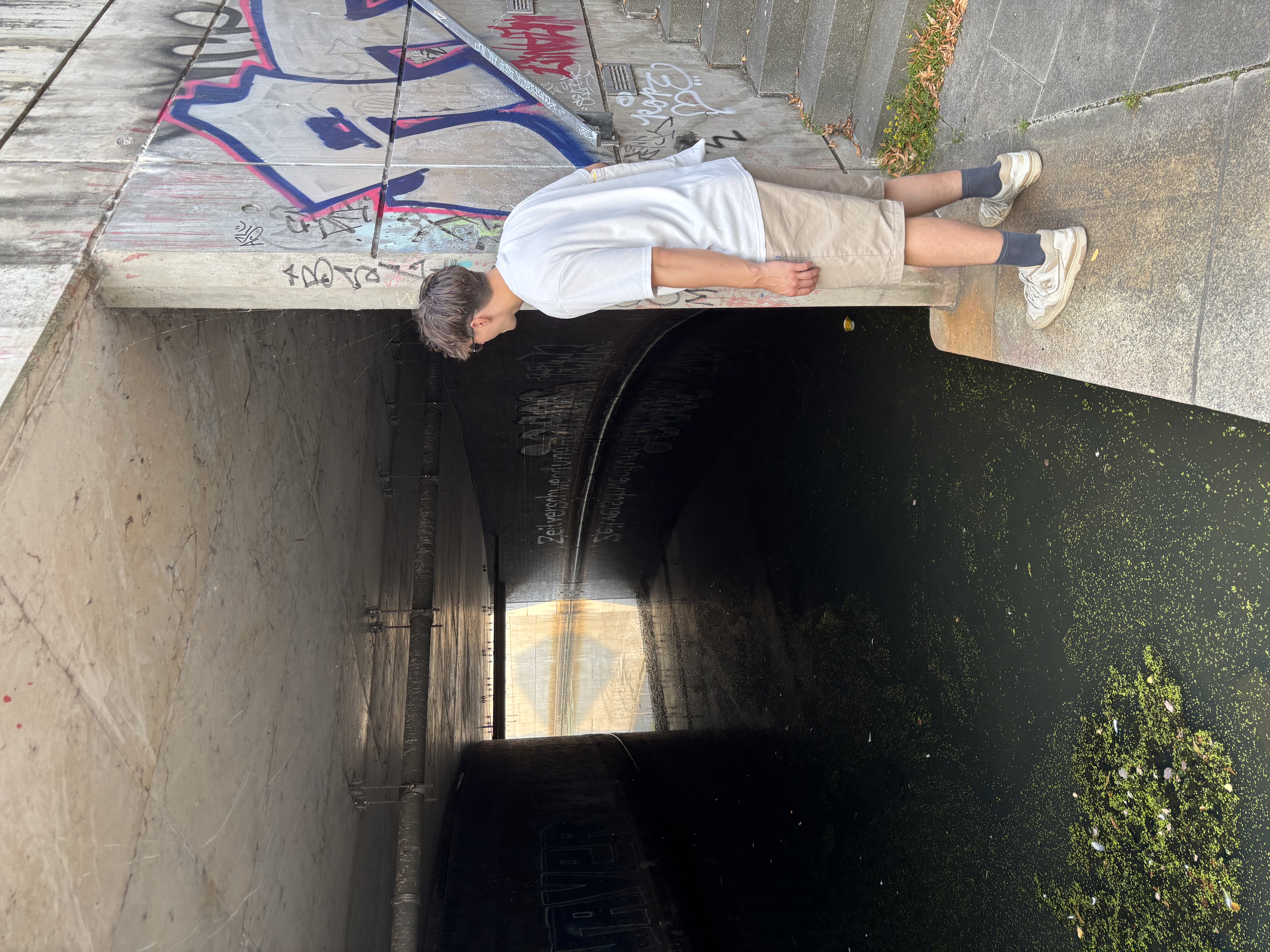
Libre Office Sans by Andree Paat, 2016 — Drawn in open-source Libre Office.
Part of a graduation project experimenting with software as a drawing tool.
Sirkel by Aimur Takk, 2014 — Each letter of the typeface is combined of three
pieces of a compass.
Bomber Fraktur by Mathias Väärsi, 2015 — Designed in
the first year after 2 months of studying graphic design. Made in the course of a week-long
workshop.
LEONE by Laura Martens, 2019 — Inspired by 'Leone à l'atterissage des avions'
by Michel François. Leone starts flying while standing strongly on the ground.
Kiwi by Gert-Rasmus Rannamets, 2020 — Nothing to do with kiwis — inspired by
early 2000s sci-fi visuals and loosely by the 1971 Nike logotype.
Sensible Senseless by Aaro Veiderpass, 2020 — Inspired by David Byrne.
Letters are blocky like his Stop Making Sense tour suit with feet underneath dancing.
Igor Rounded by Eliisabet Kuslap, 2020 — Madis-Igor's Russian father in the
family of fonts. His roundness comes from his beer belly and soft character.
Crystal by Ilja Moltšanov, 2019 — A font based on a story about a kid who
lives in a digital space.
Dahlia by Teele Kiisk, 2025 — A refined, botanical
typeface drawing from the layered geometry of the dahlia flower.
Sens by Mark Kokotov, 2025 — A contemporary typeface exploring sensory
perception and minimal form.
MS Curvy by Saara Kuum, 2020 — A monospace font based on the skeleton of
OCR-B. The curviness brings more life into an often dull monospace style.
Fairytype by Brit Maripuu, 2025 — A delicate, fantastical typeface with
fairy-tale proportions and whimsical details.
Fontenstein by Richard Vainola, 2025 — A bold constructed typeface with
monstrous charm and graphic authority.
Cap Sizun by Eva Rank, 2017 — A reverse contrast font inspired by movements
of a broad-nib pen.
Faktory by Kristjan Prik, 2020 — A sans serif font
with rough-looking shapes, inspired by old industrial factory aesthetics.
Jaan by Jaan Rõõmus, 2014 — A typeface studying unconventional tools for
drawing.
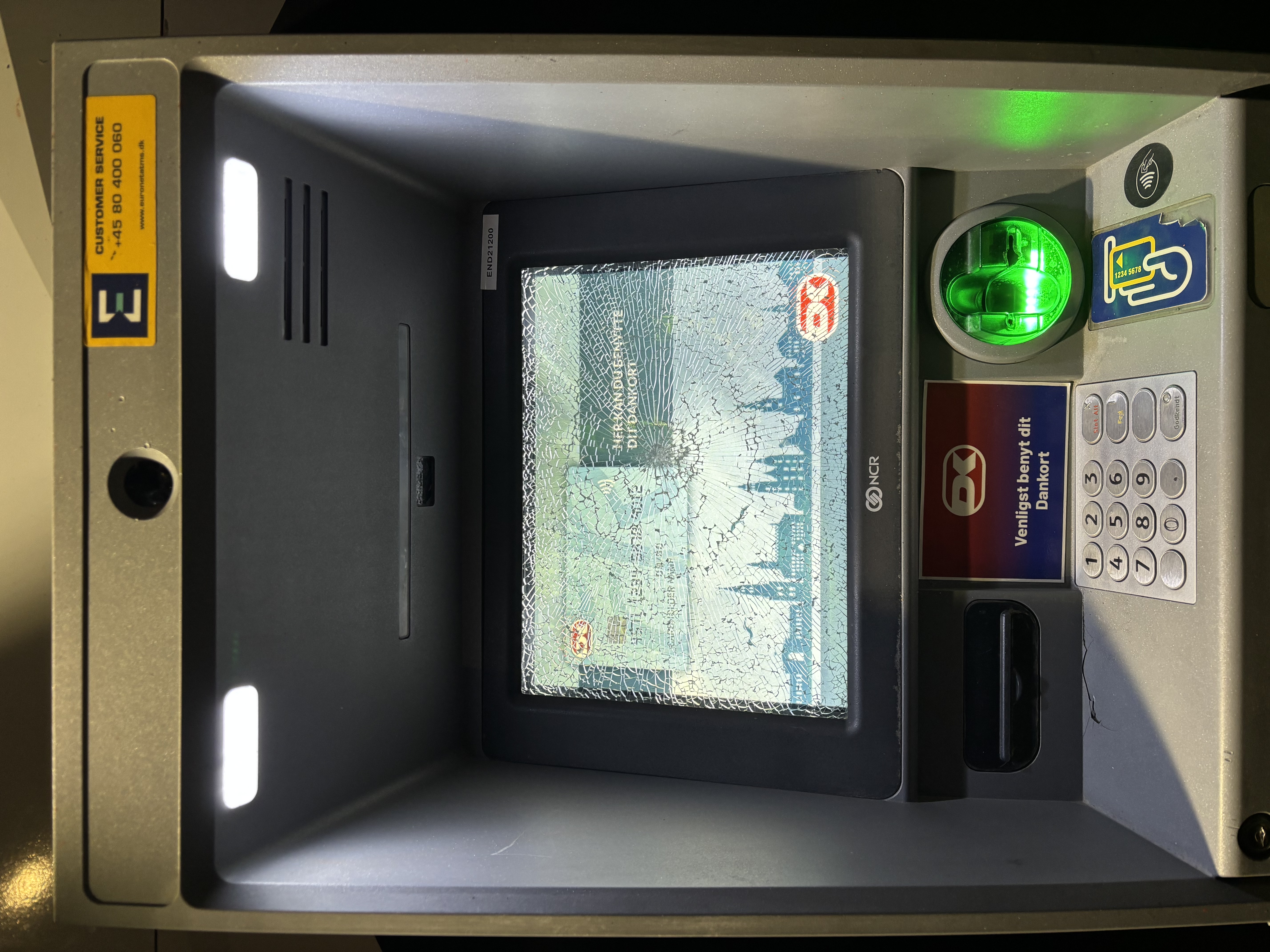
Nocturnal by Katarina Sarap, 2017 — Inspired by dreams where everything is
upside-down and out of control.
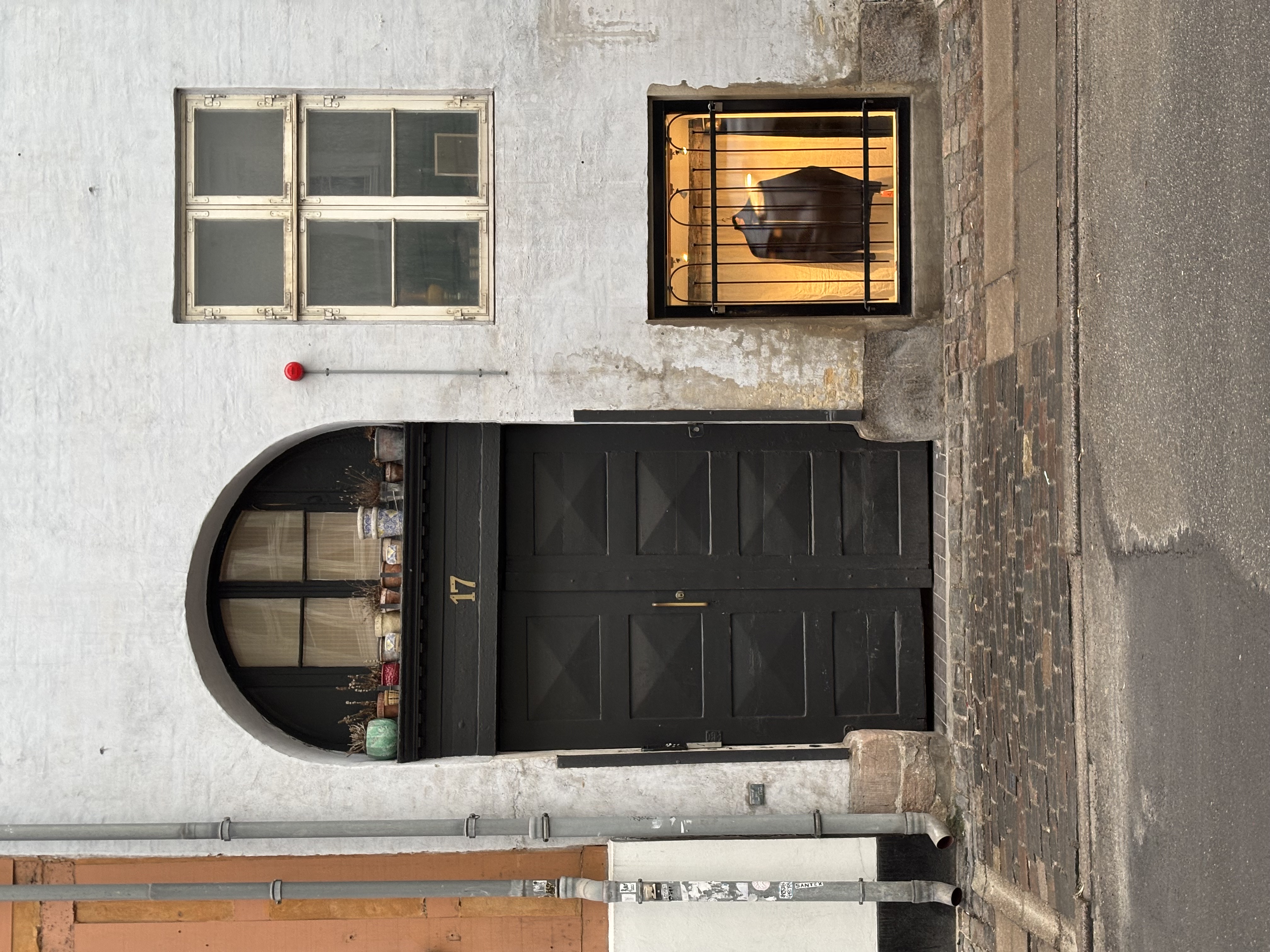
Shattered by 2025 — A fragmented, expressive display typeface exploring the
aesthetics of rupture and reconstruction.
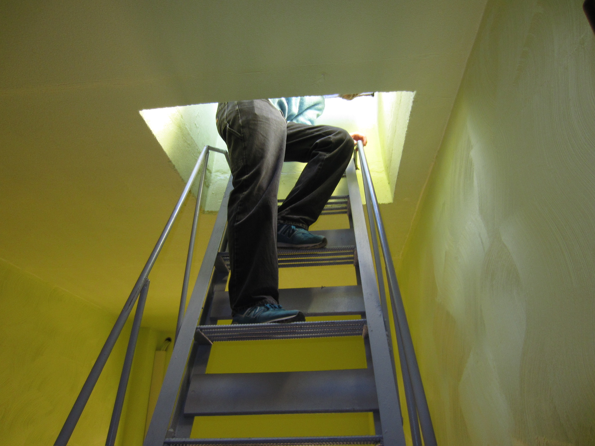
BRNO2016 by Vello Lutter & Mathias Väärsi, 2018 — First designed for a school
course, later adapted for the book Brno Guide. Named after a sign in Mathias Gallery in Brno.
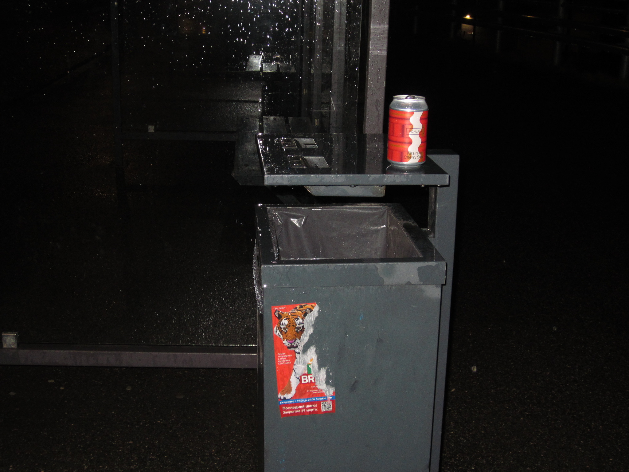
Žak by Marje Kask, 2019 — Based on a character who is a hat-wearing vampire.
One day he loses his hat and discovers his impersonator.
I Dream of Letters by Mira Keygnaert — Created as part
of Typography 1 class — 7 weeks of experimenting and 7 weeks of type design process.
Lumberjack by Birgita Siim, 2020 — Inspired by the forester's ancient helper
— the axe. Figures mix sharpness and clumsiness.
Skeleton by Kristi Jaago, 2020 — The Skeleton font is inspired by the font
Baskerville centerline.
Volask by Mathias Väärsi, 2016 — Designed in the second half of the first
year. The font was made only using CSS code.
Kykeon by Martin Kislõi, 2025 — An experimental typeface exploring ancient
ritual aesthetics and contemporary letterform construction.
Helipleumon by Katariina Tõnismäe — Created as part of Typography 1 class — 7
weeks of experimenting and 7 weeks of type design process.
Kalevgrotesk by EKA students — A grotesk typeface
drawing on Estonian folk tradition and the epic poem Kalevipoeg.
Kulm by Laura Merendi, 2018 — Constructed from crumbled-angry eyebrows — the
shapes people make while swearing.
Fiato by Agnes Isabelle Veevo, 2020 — Strong but delicate, mixed with bolder
and thinner lines. 'Fiato' means breath in Italian — for everyday use.
Escapist Diaries by Alíz Stocker, 2019 — Based on an imaginary coming-of-age
film, starring a fragile teenage girl.
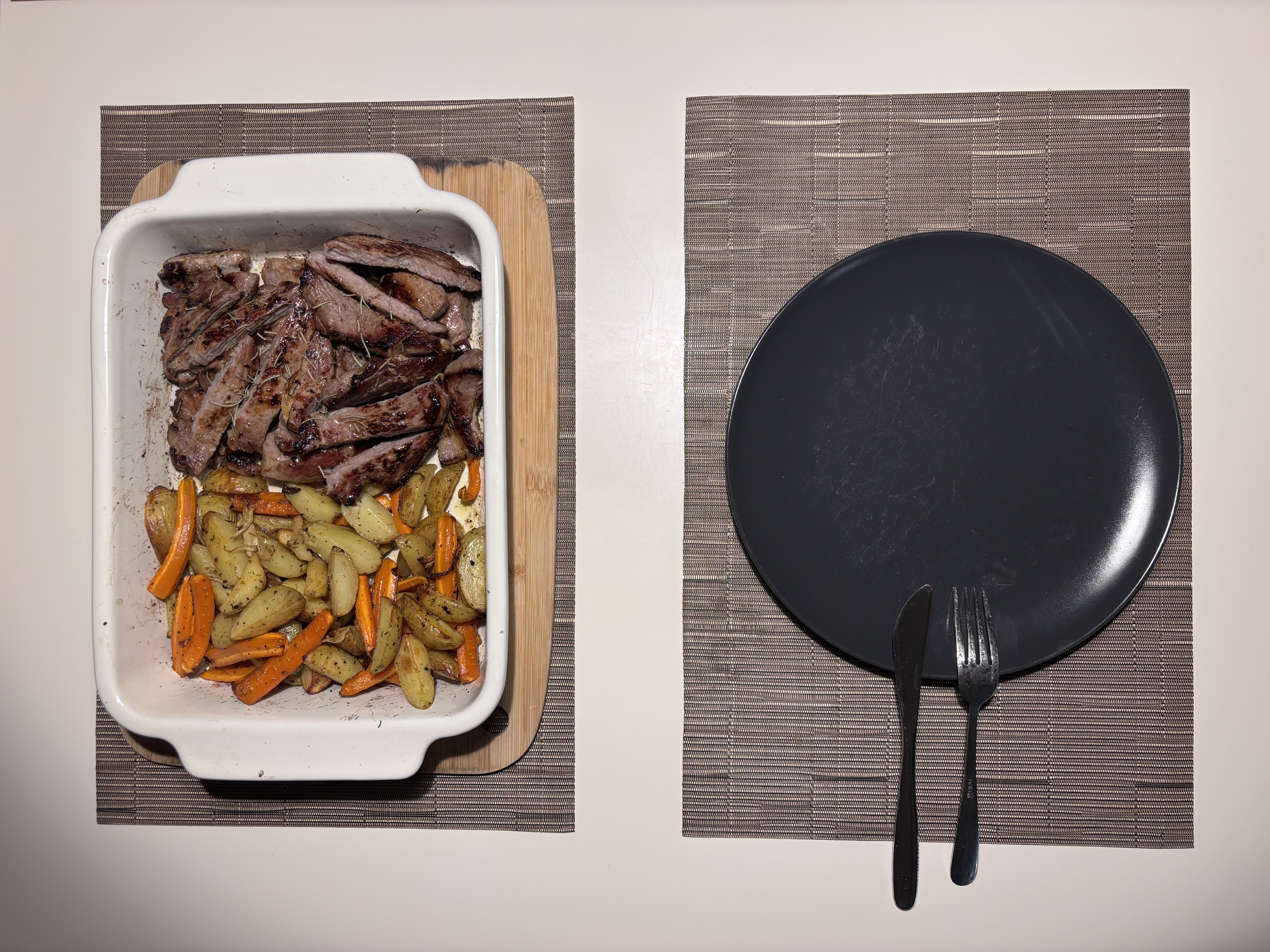
Akijo by Adam Asztalos, 2019 — Inspired by a fictional movie about a ninja
taking revenge on his parents' killers. Fast, dangerous, ruthless.
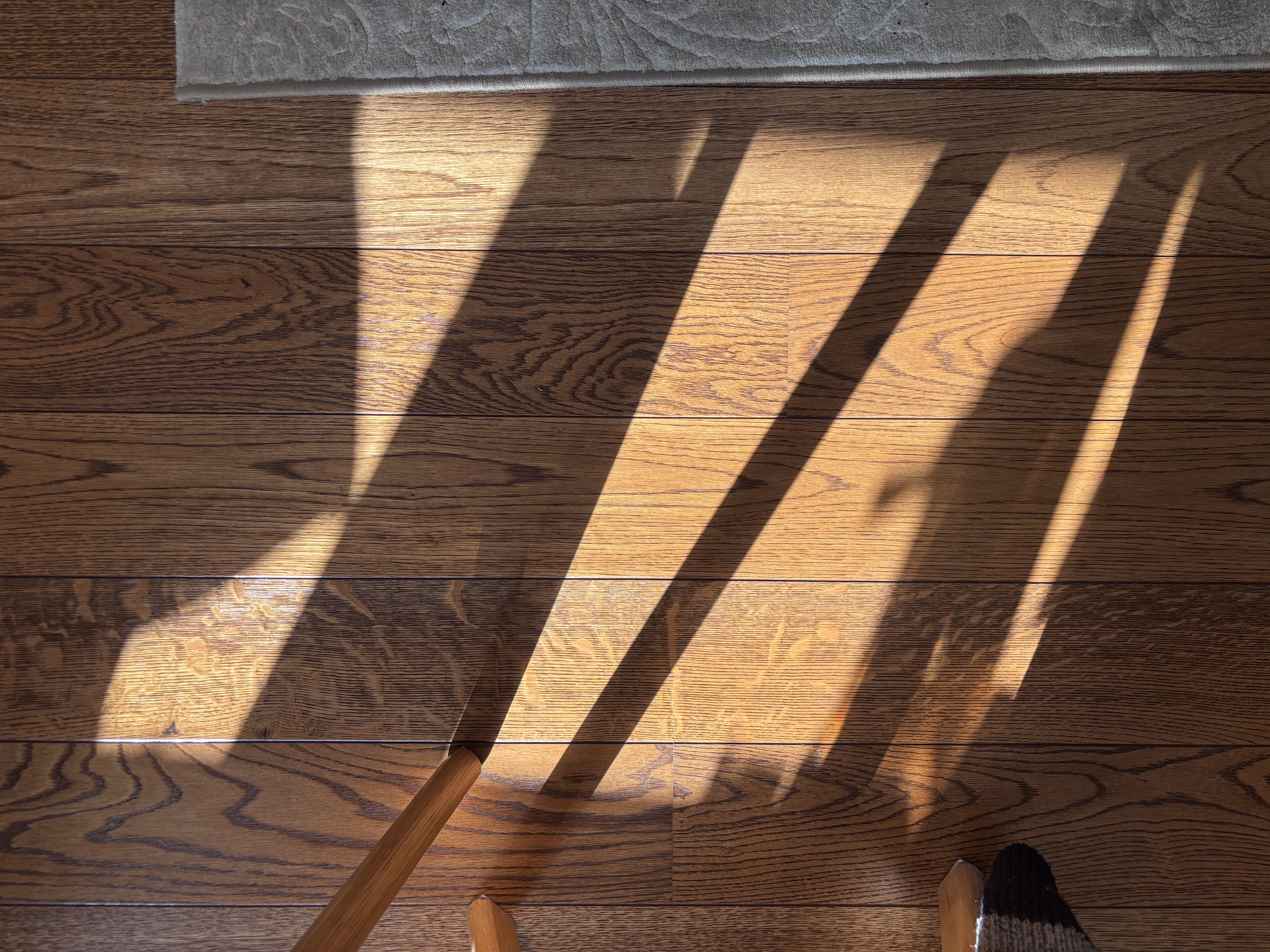
Exquisite Corpse by EKA students, 2023 — Students took turns drawing letters
according to a rule. Each letter has as many layers as there were groups. Rendered as a variable
font.
Hypha by EKA students — A mycelial typeface — letters
that grow and connect like fungal networks beneath the surface.
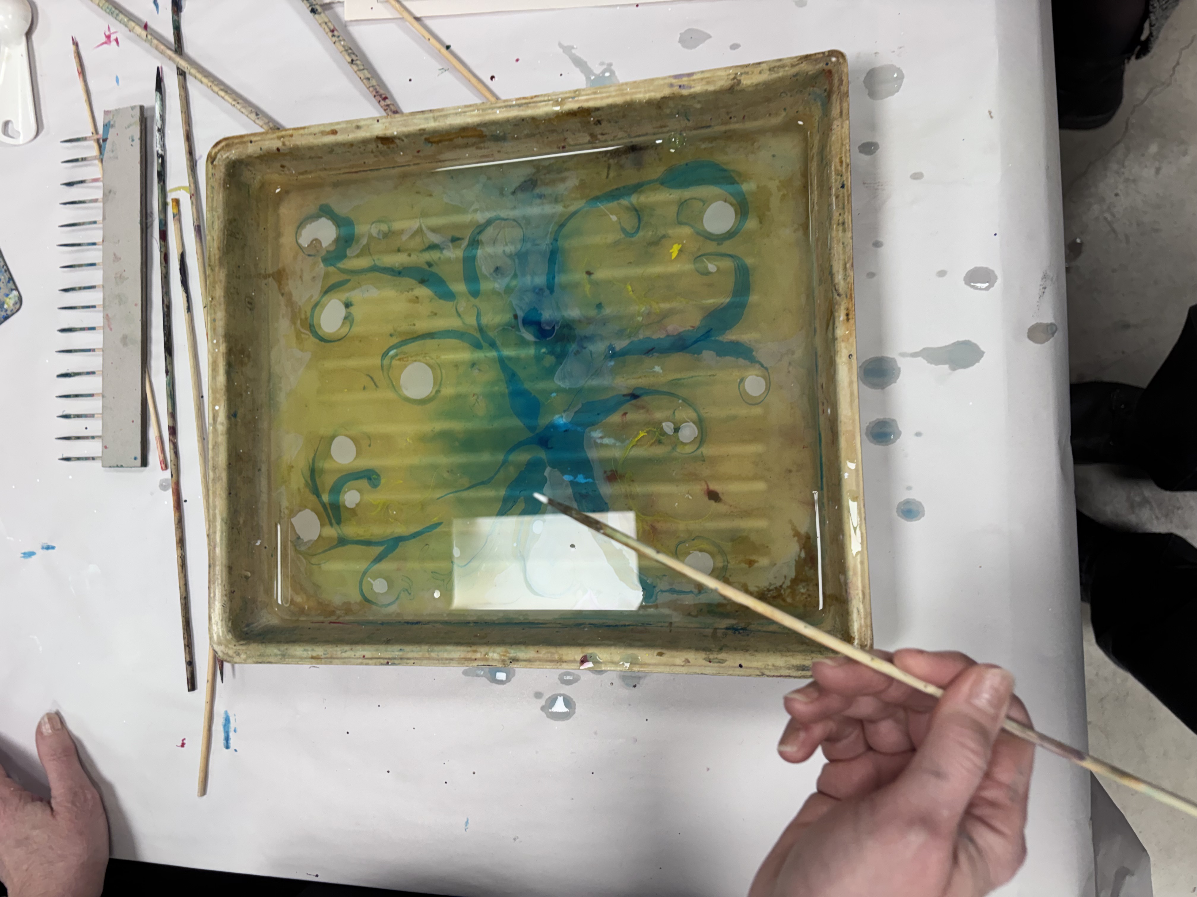
SafariTraveller by Mirjam Varik, 2019 — The font is inspired by desert,
Africa, and traveling around there.
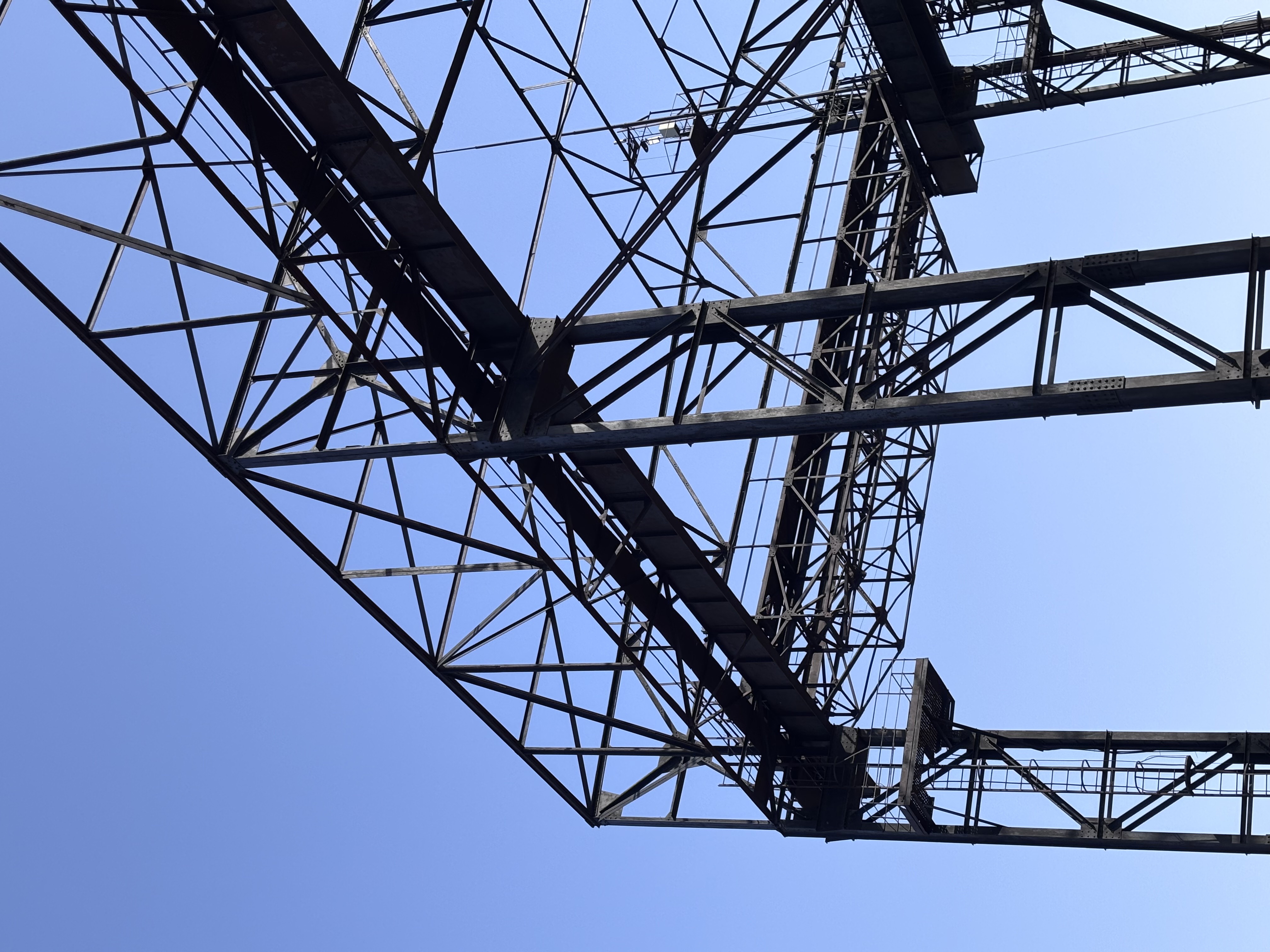
Lazy Glamour by Nora Pelšs, 2020 — A glamorous font whose essence is to look
a little bit out of place and wonky.
Frisbee by Fiona Helen Arenz, 2020 — Inspired by the dynamic movements of 70s
Ultimate Frisbee players. Sporty but groovy display font.
Work Sans TASE by Aimur Takk, 2016 — Modified for the Estonian Academy of
Arts graduation festival TASE'16. Based on Wei Huang's Work Sans.
Maurizio by Jaan Pavliuk, 2020 — Inspired by outer space explorations,
delirious states of mind, and music by Basic Channel.
Apollo by EKA students — A crisp, spatial typeface
evoking the precision and optimism of mid-century space-age design.
Madis-Igor by Eliisabet Kuslap, 2019 — The outlined font symbolises staying
anonymous while Cyrillic letters emphasise Russian cultural influences.
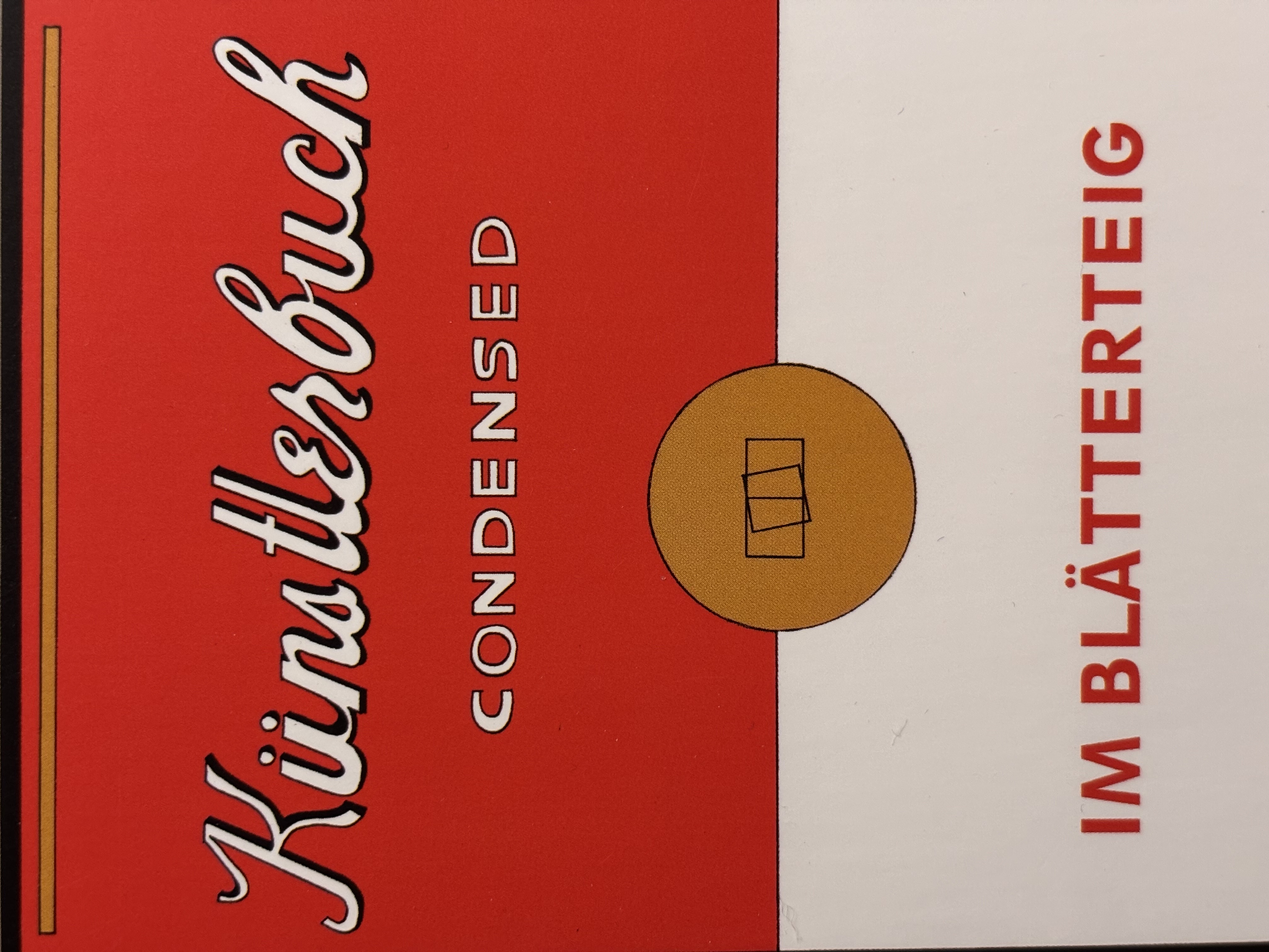
Teibifont by Andree Paat, 2016 — Inspired by duct tape, created for the
Interior Architecture department of EKA.
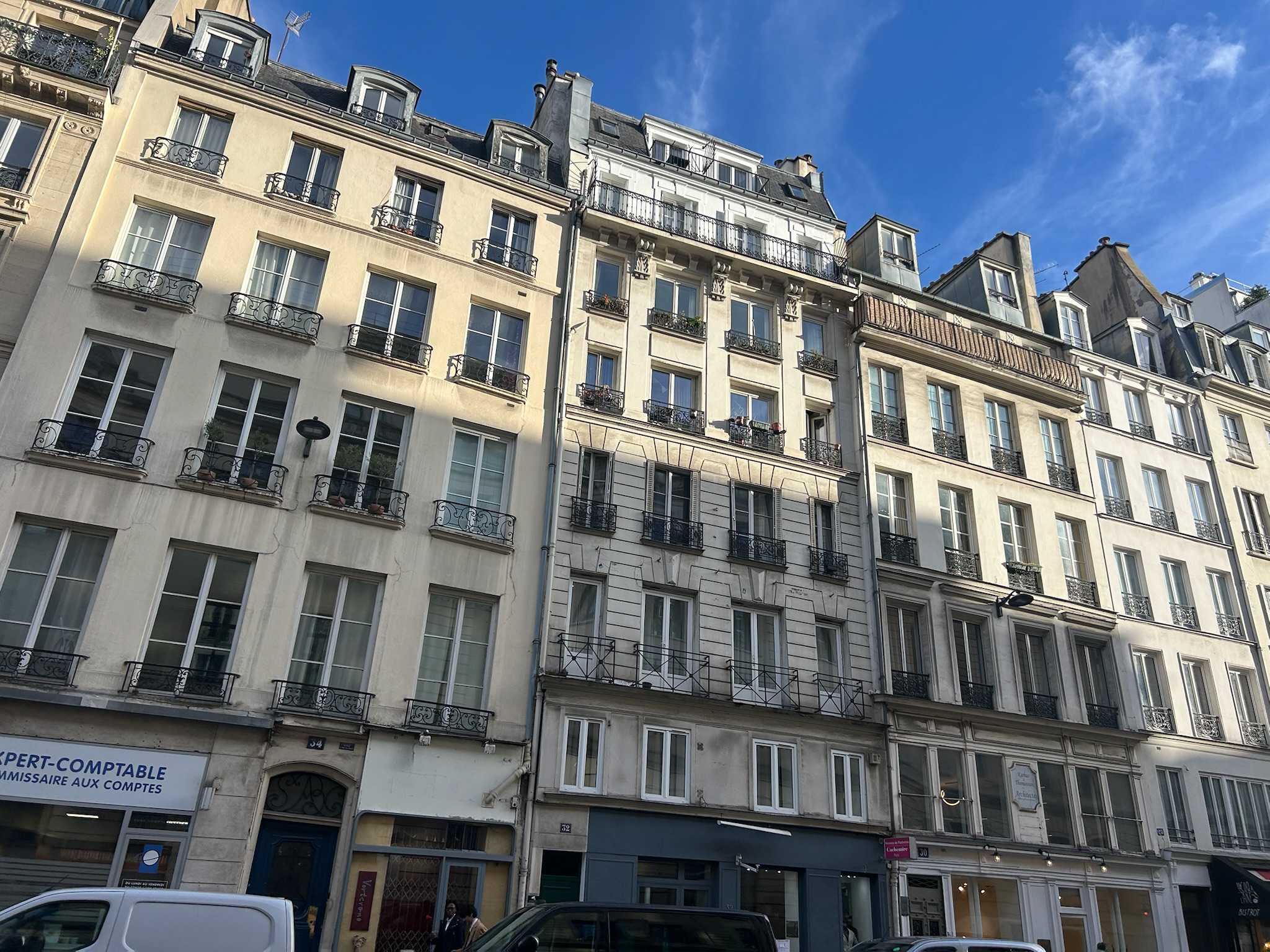
Gog by Elisabeth Mägi — Created as part of Typography 1 class — 7 weeks of
experimenting and 7 weeks of type design process.
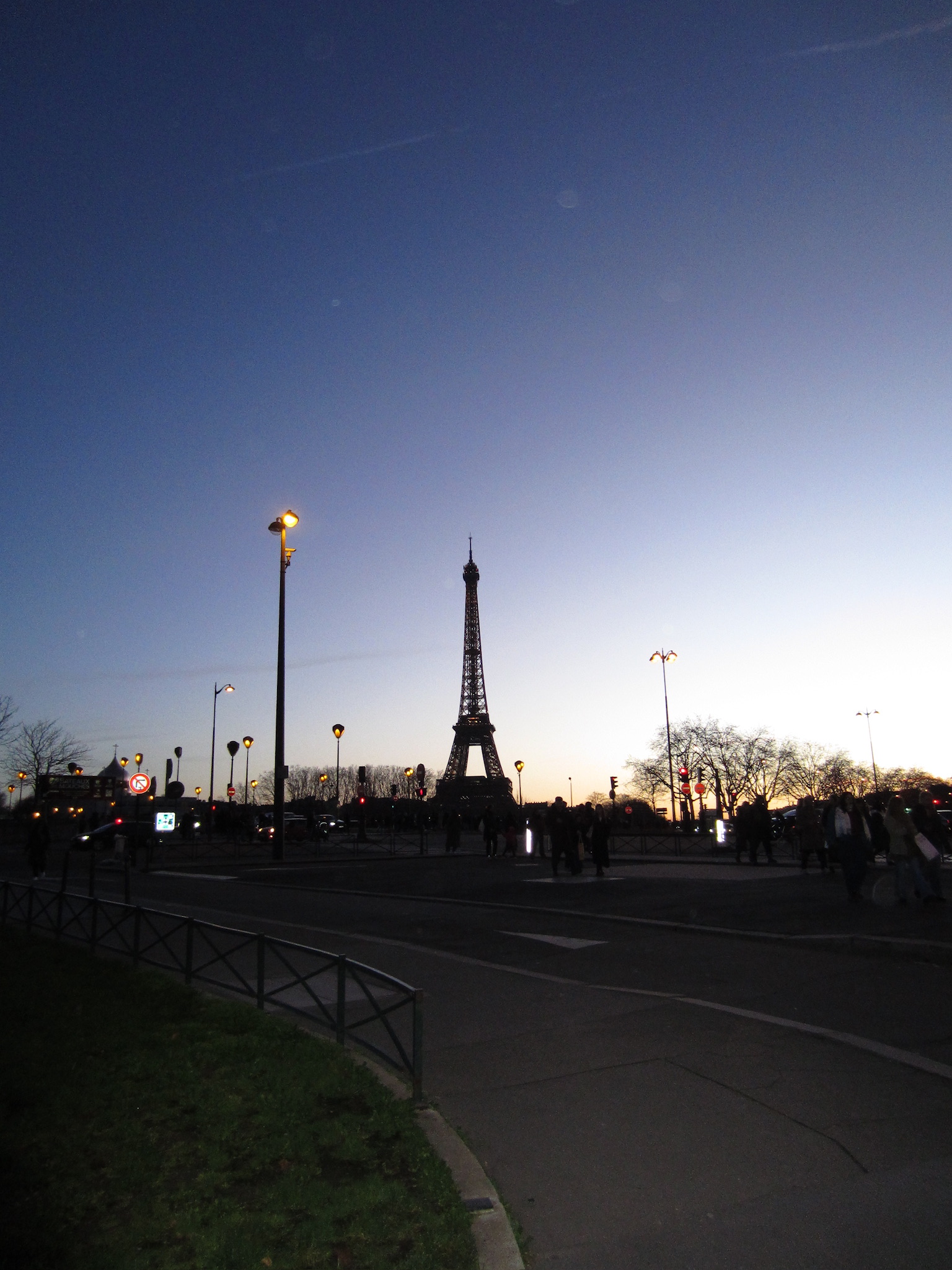
Radio by Pavel Salmin, 2020 — Based on Soviet magazines for radio amateurs.
Refers to electronic schemes and typography of that era.
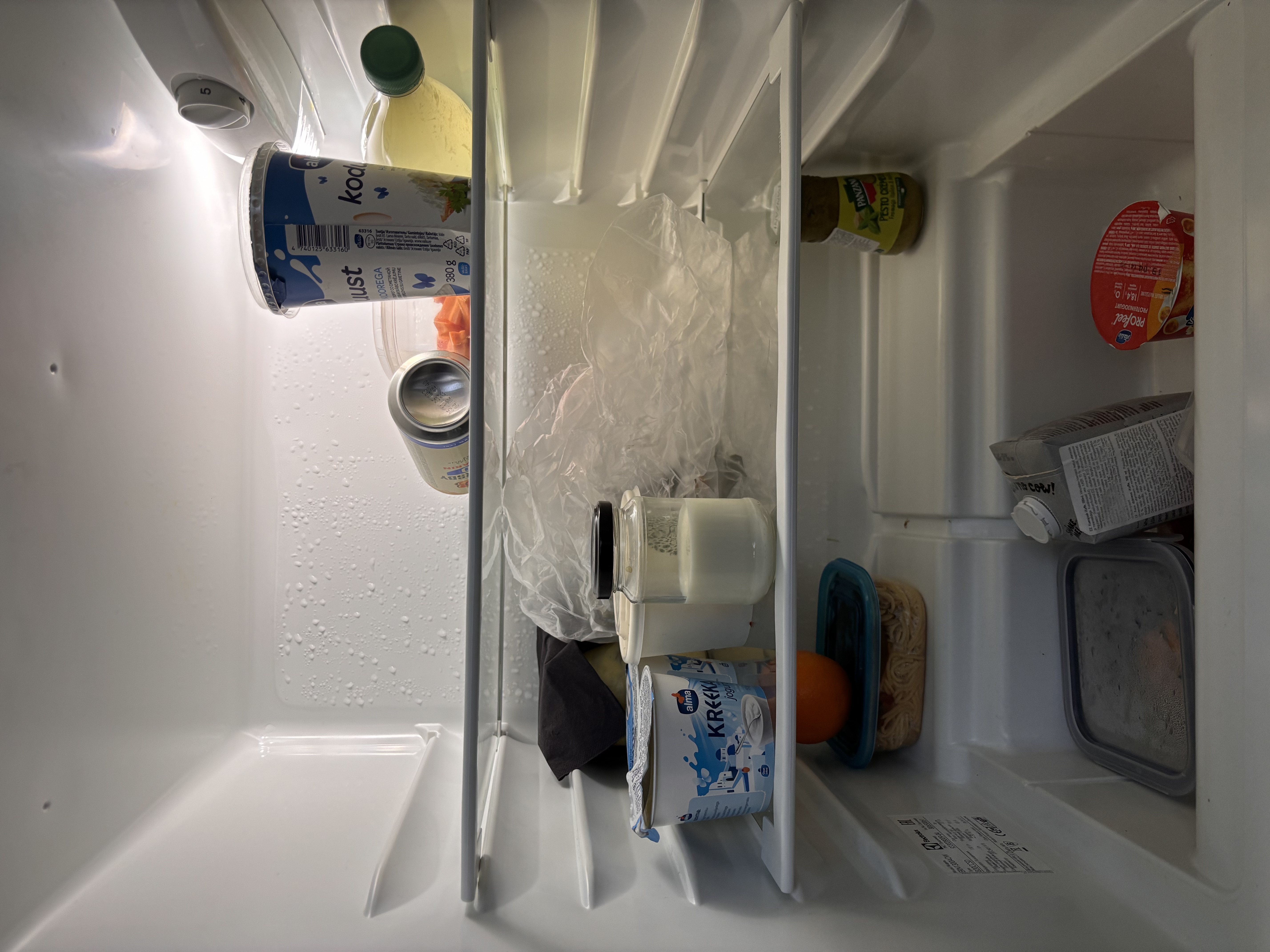
Susle by Ingel-Kristen Veevo, 2020 — A type system based on the QWERTY
keyboard grid. Shapes fit like a puzzle — combine forms, encrypt information, or create visual
emblems.
Masurka by EKA students — A rhythmic display typeface
inspired by the energetic tempo of the Polish masurka dance.
Varenyky by Anneli Kripsaar, 2018 — Inspired by Ukrainian cherry varenyky —
dumpling-like boiled pastries from childhood summers in Odessa.
DEWY by Martin Kipper, 2019 — The interpretation of a pencil's life full of
hardships inspired the creation of DEWY.
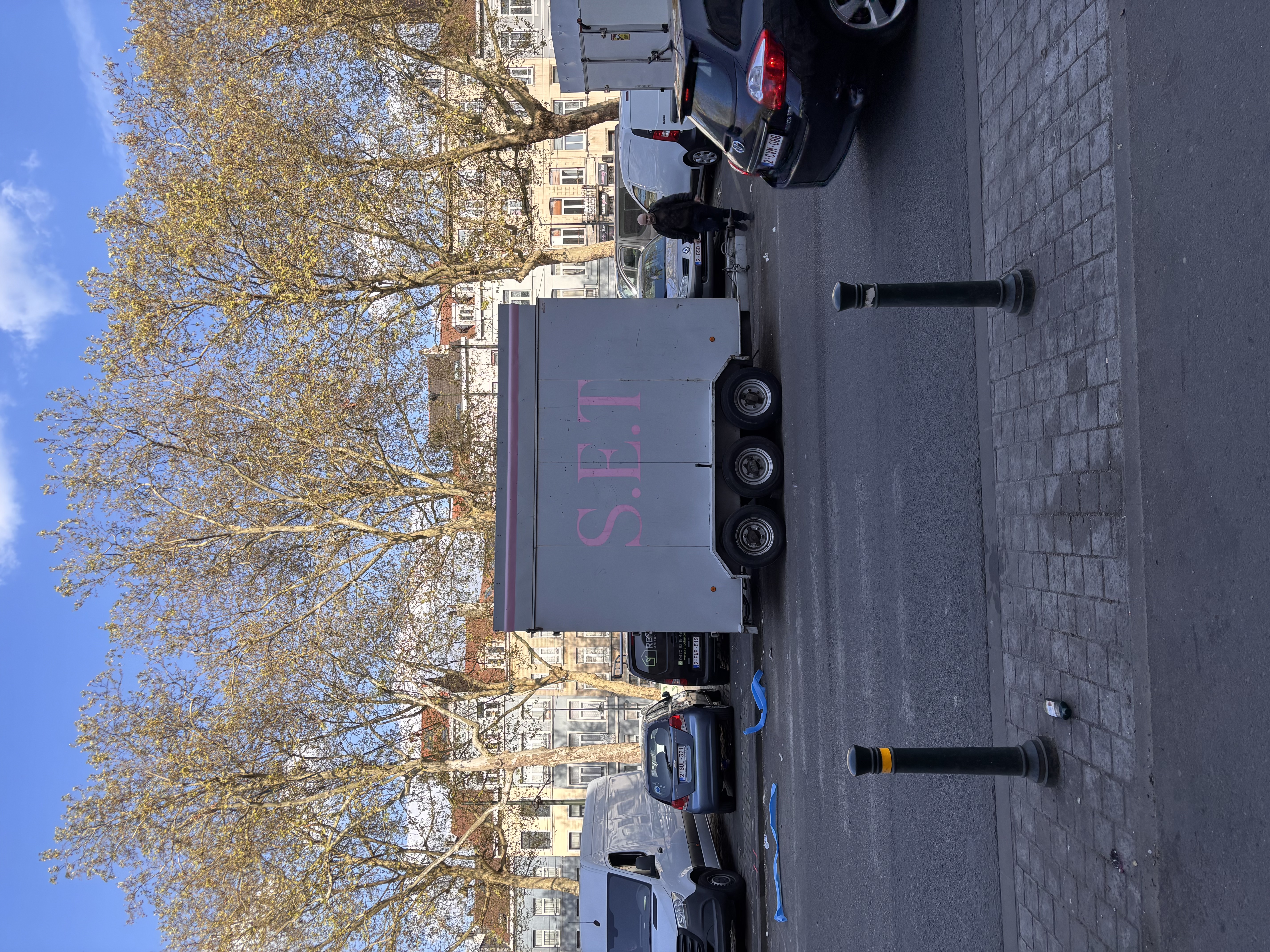
Gary by Martin Kipper, 2020 — Born through digitalising the Binner typeface
and making it clearer.
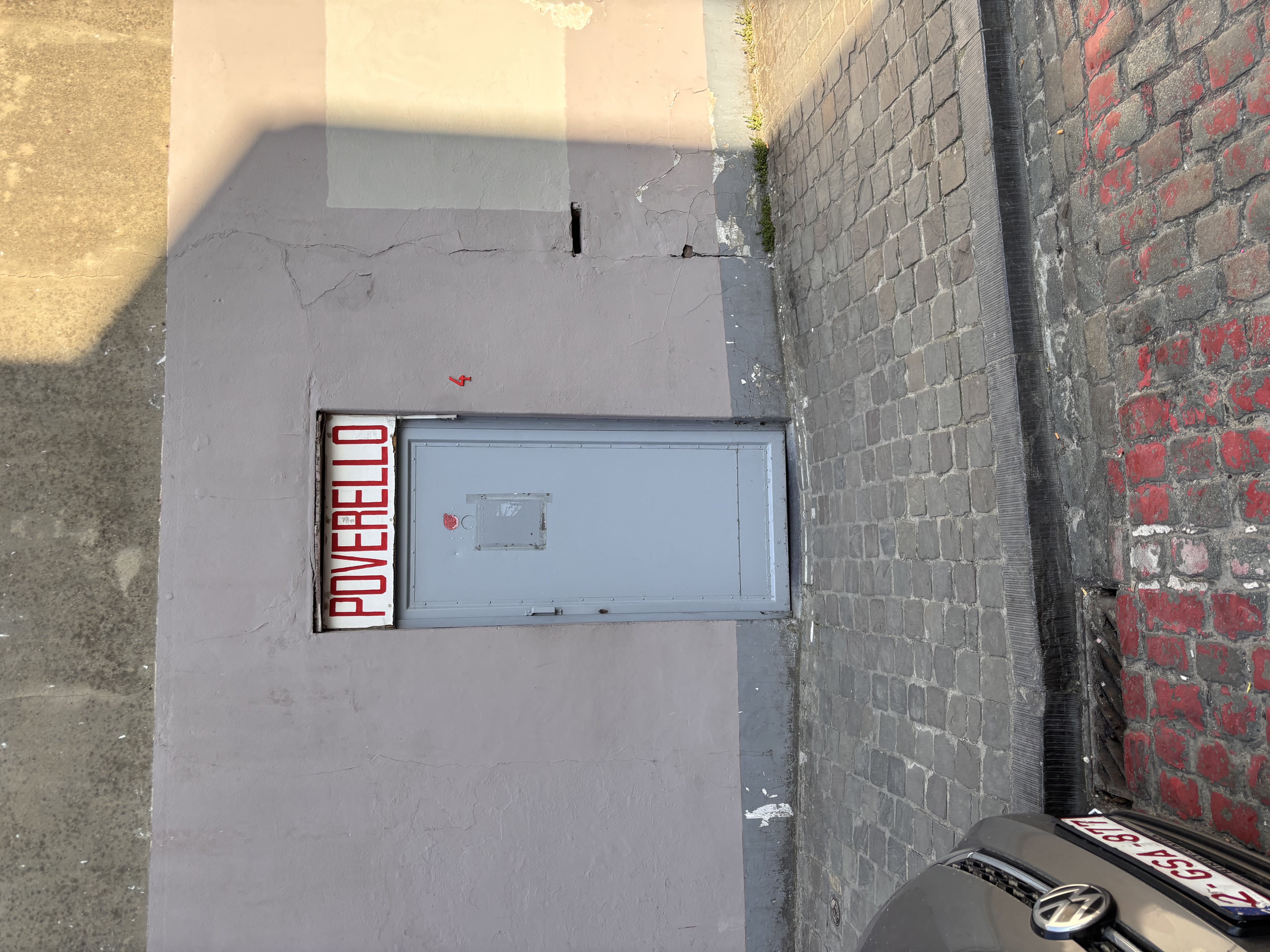
Fallengum by Ryan Kaabel — Created as part of Typography 1 class — 7 weeks of
experimenting and 7 weeks of type design process.
Franz by Agnes Isabelle Veevo, 2019 — A typeface based on a character with
opposing personalities — one side shy, the other bold and outgoing.
Tiltortion by EKA students — Letters warped and tilted
— a typeface that questions the straight axis of conventional typography.
Leimzy by EKA students — A loose, hand-inflected
typeface with the irregular warmth of a letter written in a hurry.
Barbara by EKA students — A bold, expressive display typeface.
Broadnibber by EKA students — Inspired by traditional calligraphy tools.
Cofe Sans by EKA students — A clean, modern sans-serif.
Dematerialized by EKA students — Exploring the boundaries of legibility.
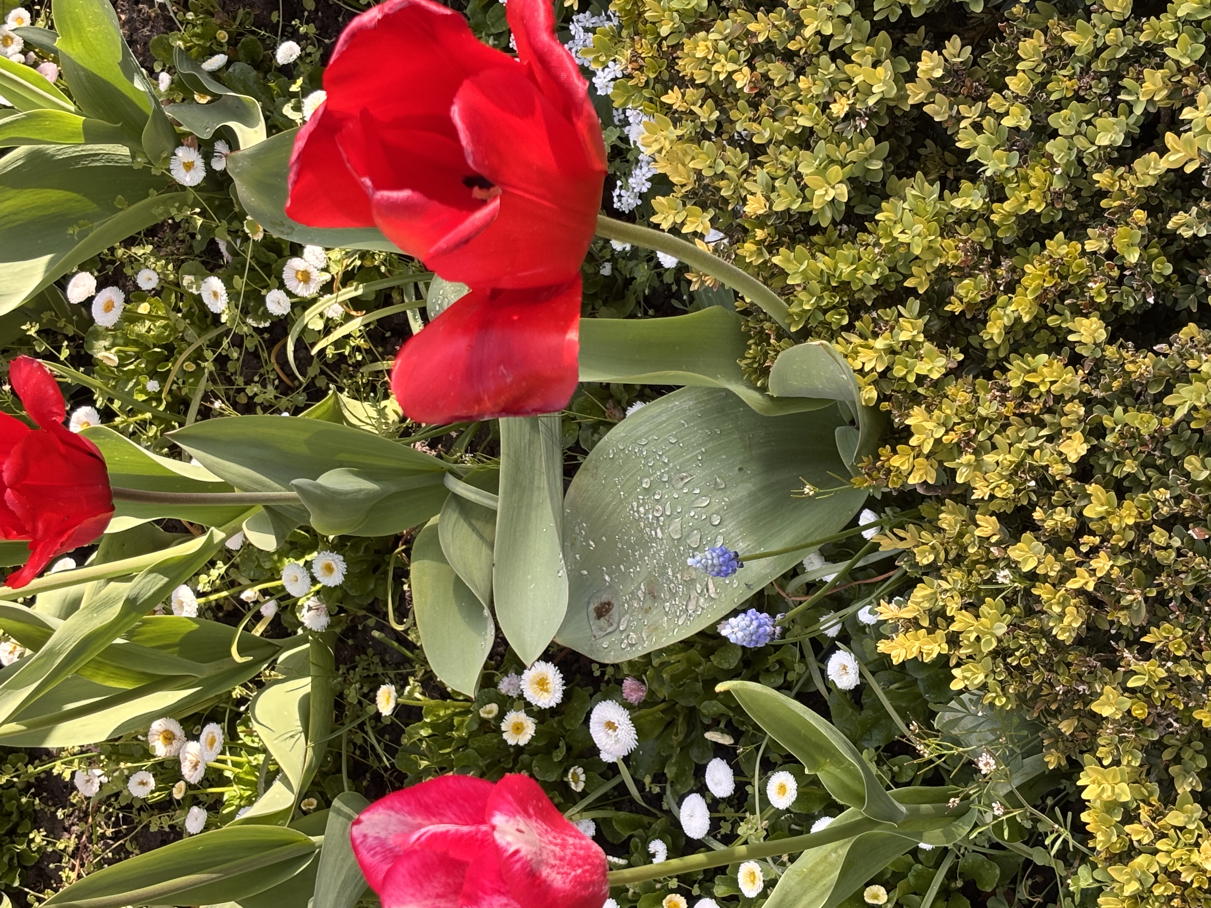
Flora and Fauna by EKA students — Organic shapes and intricate details.
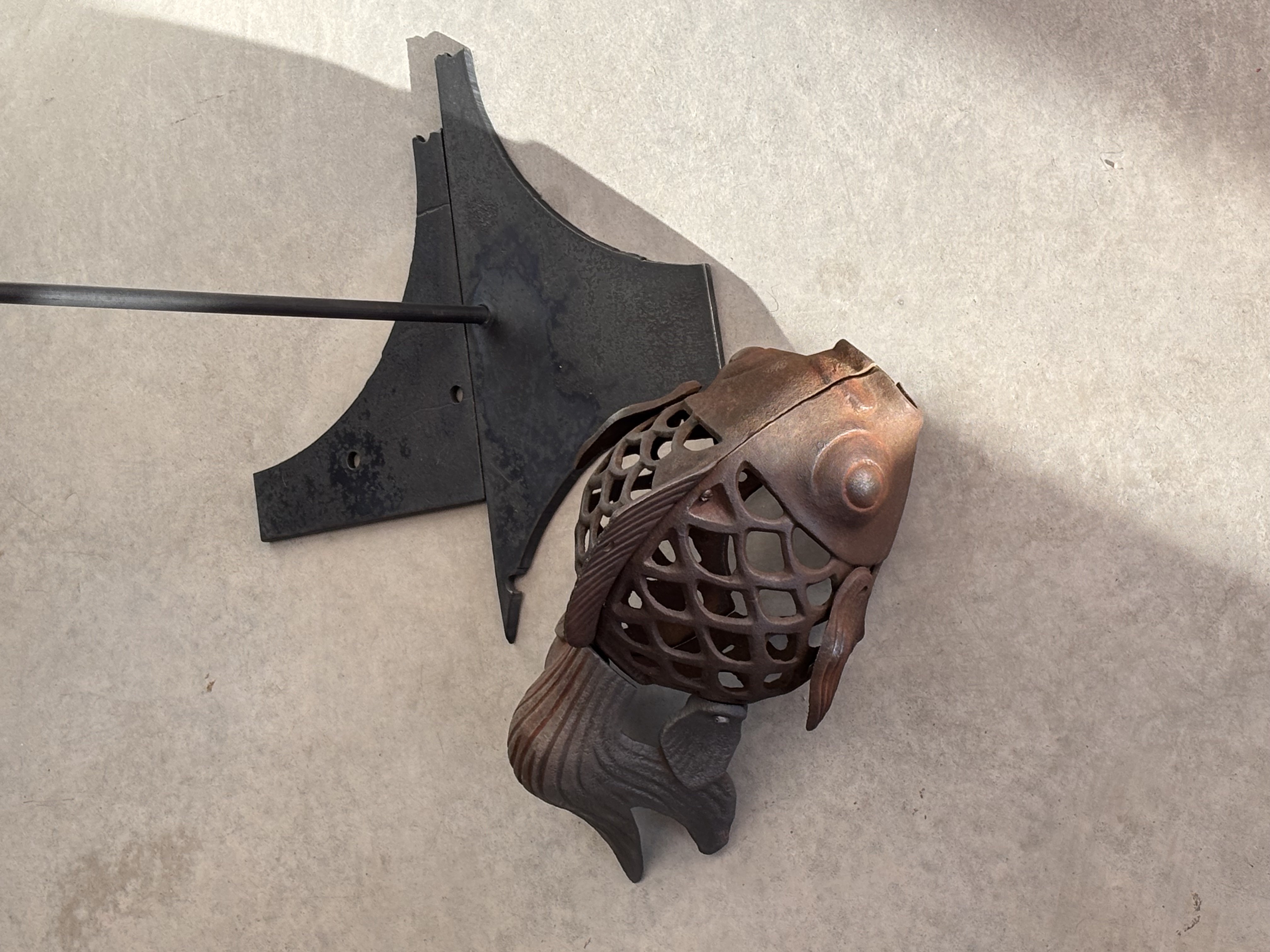
Fontanne by EKA students — A graceful display typeface.
Heavy by EKA students — A powerful, high-impact sans-serif.
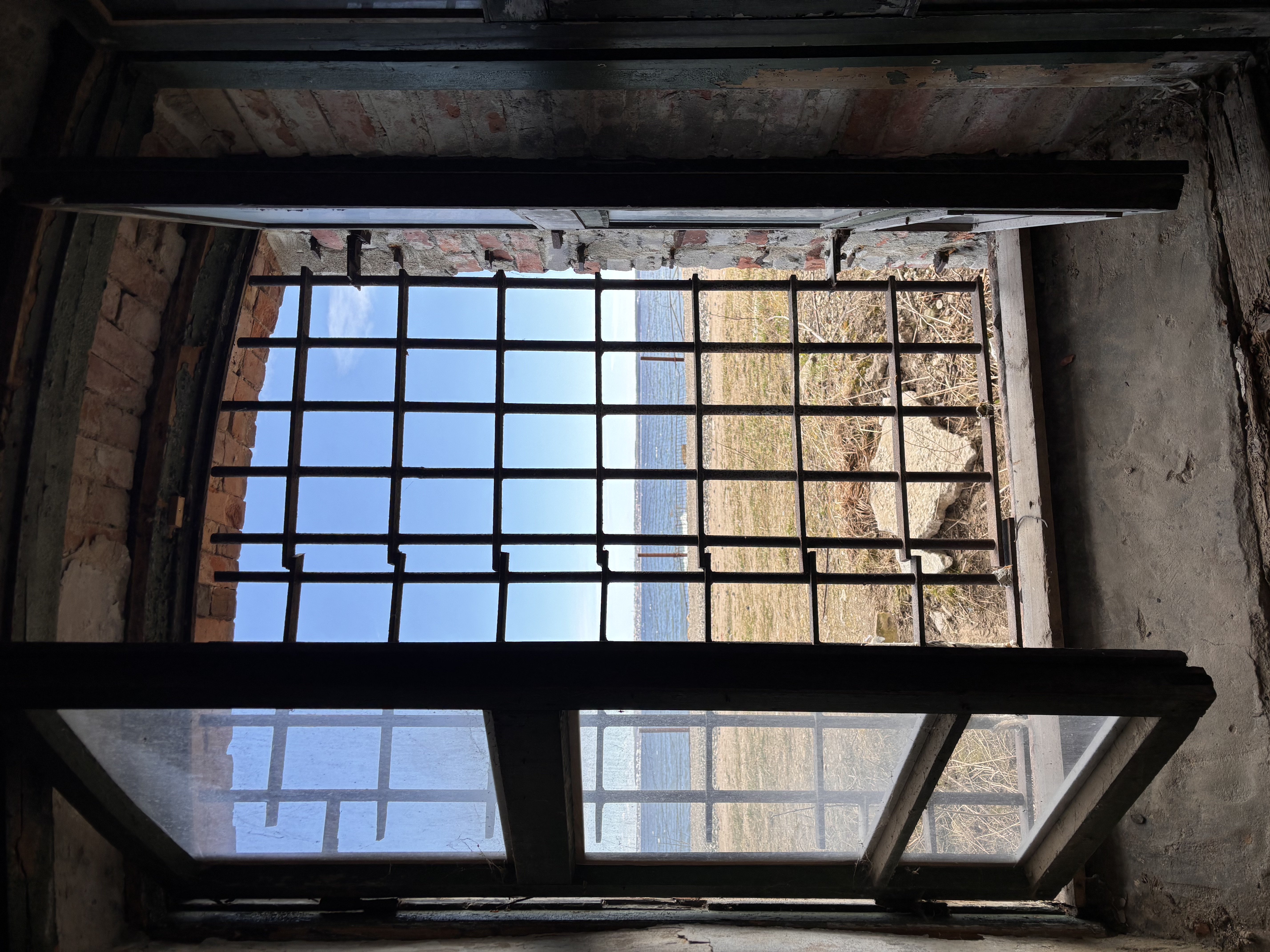
Kalevgrotesk 2 — A refined variant of the classic folk-inspired grotesk.
Kandi 3 by EKA students — Playful and geometric.
Keynote Sans by EKA students — Professional and versatile.
Kollektiiv Collective by EKA students — A typeface for shared voices.
Molot — A bold, heavy display font with industrial strength.
Sato by EKA students — Minimalist and precise.
Soy by EKA students — Expressive and unconventional.
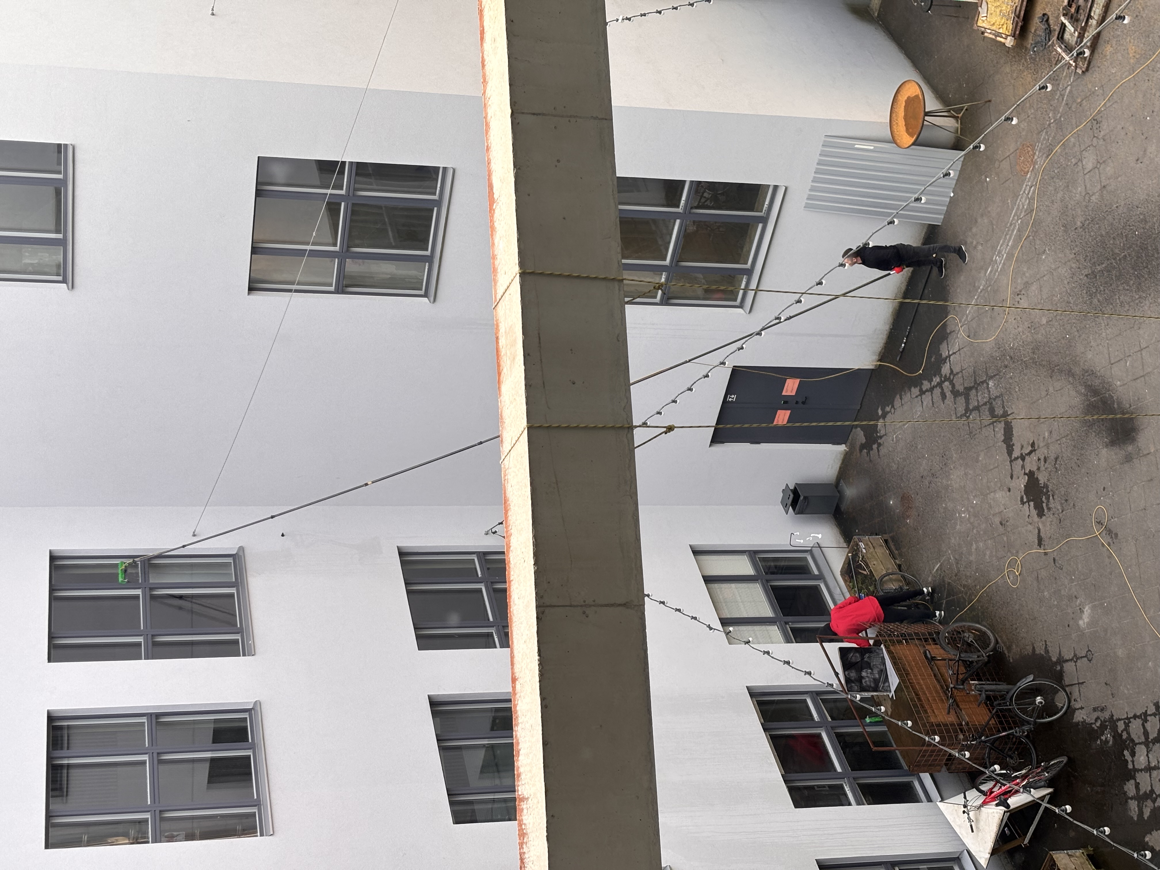
Substanta by EKA students — Bold and structural.
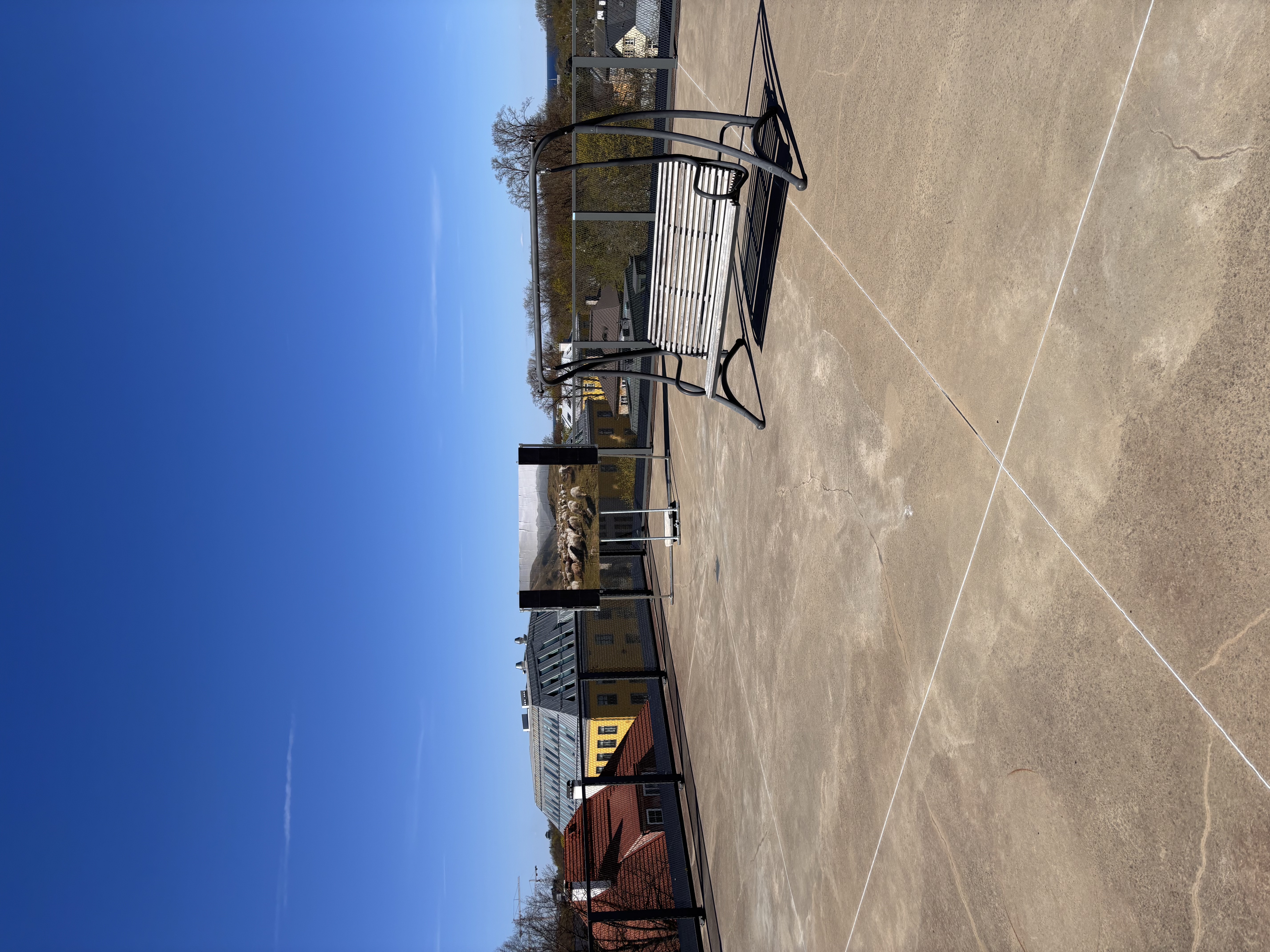
Tirnot Mono — A quirky, characterful monospace typeface.
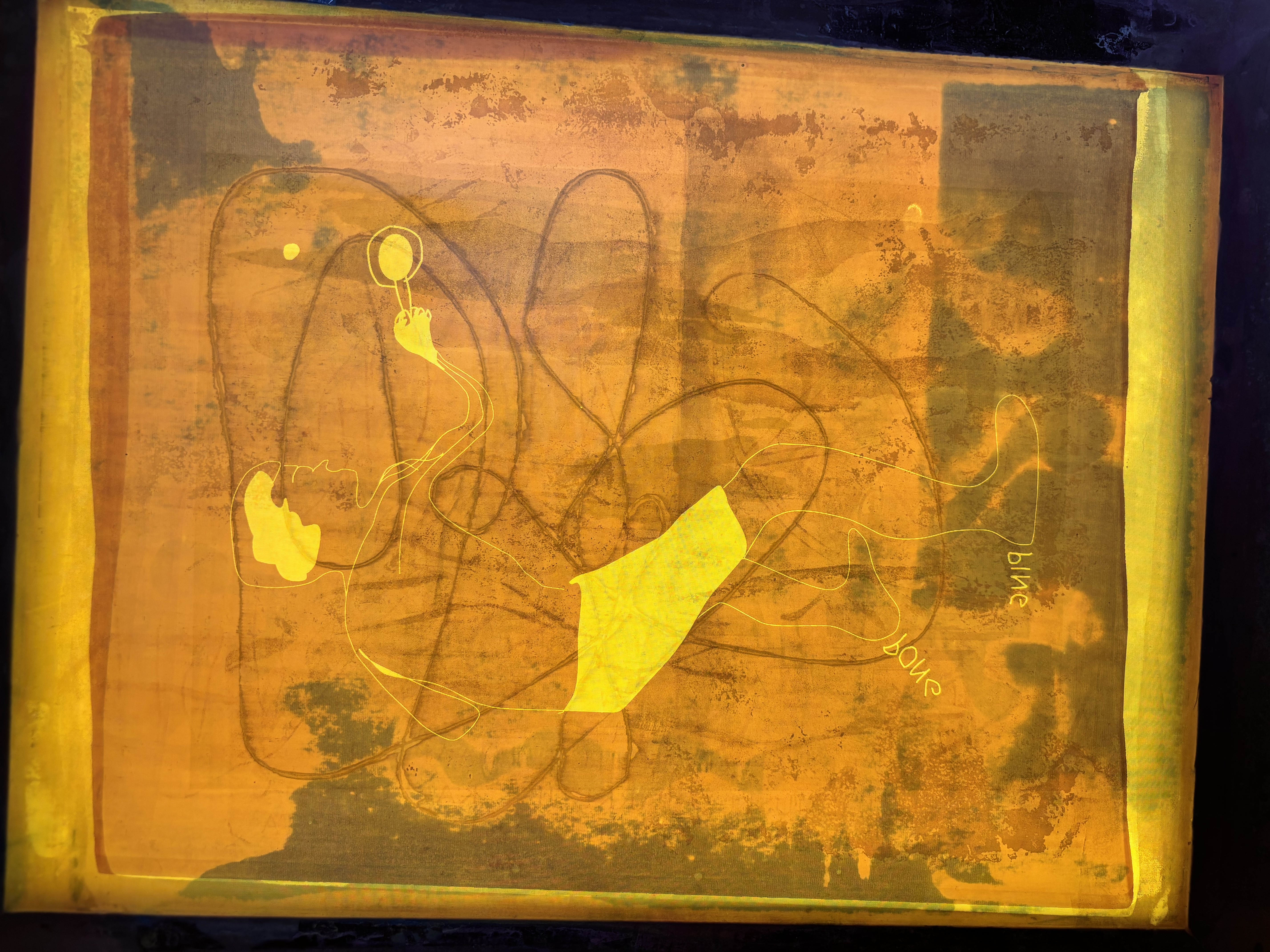
Toilet Paper Type — A humorous, tactile display font.
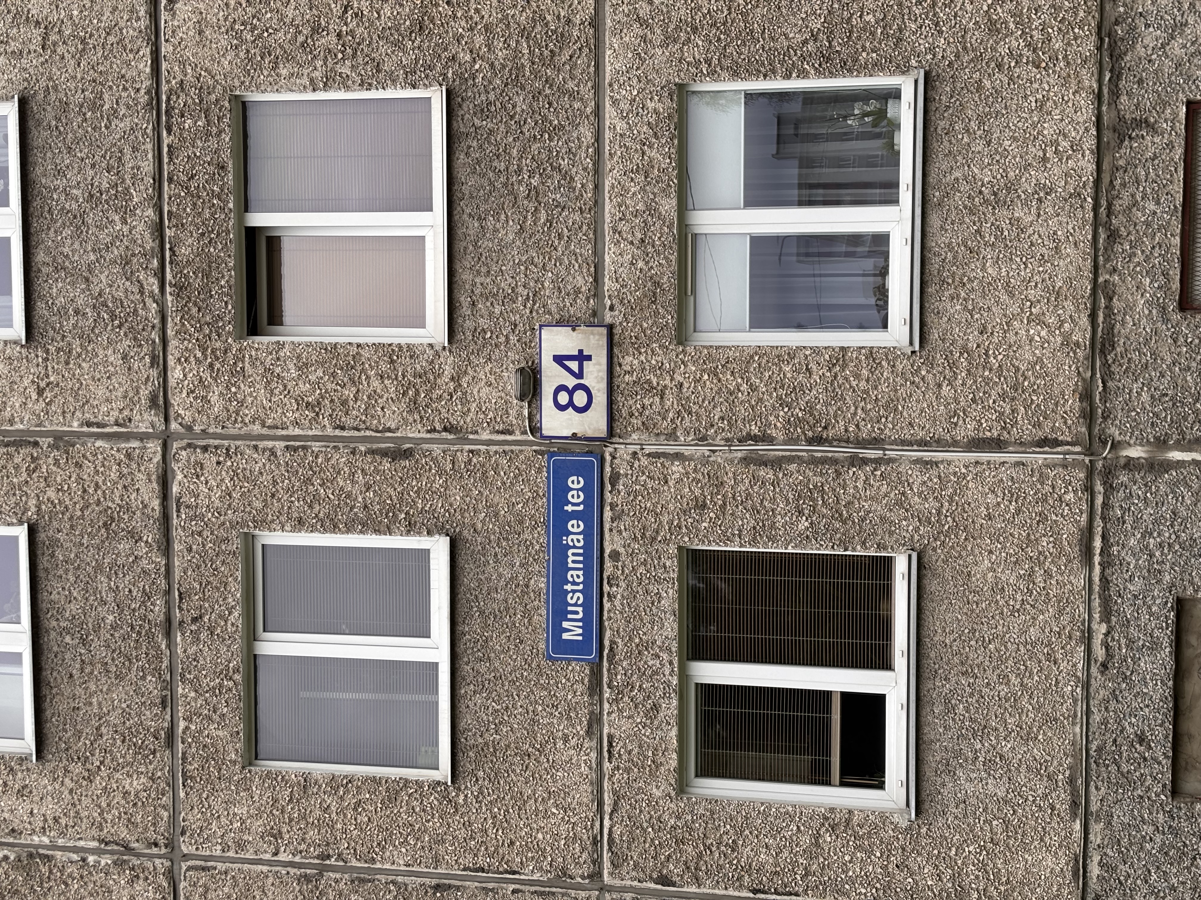
Tontfont — Inspired by ghostly shapes and shadows.
Velodromatic — A fast-paced, rhythmic display font.
Yoga — Balanced and fluid letterforms.
My Maps Sans — World map projection series (1/4).
My Maps Sans — World map projection series (2/4).
My Maps Sans — World map projection series (3/4).
My Maps Sans — World map projection series (4/4).
CONTACT
suvatypefoundry@artun.ee
Department of Graphic Design
Estonian Academy of Arts
Põhja pst 7, Tallinn, Estonia